- Usability, Learnability, Memorability
- Tognazinni’s Paradox
- Design Integrity, Simplicity and Abstraction
- Discount Usability Testing
- Personas
- Goals vs. Tasks
- Information Design
- Performance, Data Pixels, Location, and Preattentive Attributes
- Icons, Pedagogic Vectors, Forms Design and Posture
- Mental Models, Input Modes and Cognitive Friction
- Search
- Data Display
A good principle for medical software is to design for the ED as a worst-case scenario. If it works there, it will work anywhere.No clinicians are as time-pressured as those in a busy Emergency Department. There, distractions – even seemingly minor ones like presenting a complete CBC instead of an abstract – slow the clinician down, and may distract from something more important.
Quoting from a recent presentation at HIMSS:
Emergency physicians are majorly stressed and working at max capacity already. Darwinian selection means that ED staff (this is from the Critical Incident Stress Management literature):
- have obsessive/compulsive personality traits
- they like to be in control
- they are risk oriented
- they are action-oriented
- they “need to be needed” and
- they are dedicated
Emergency physicians are interrupted far more frequently than other physicians, and the same is true of ED nurses, techs, and certainly clinical secretaries. So, those in the ED are intolerant of anything that wastes their time. (Look at the “Dueling whiteboards” picture at the beginning of this post; note the number of users of the handwritten whiteboard vs. the computer-based one.) This is why the IT department (Information Technology = “the computer nerds”) traditionally hates the ED, and why IT projects fail in the ED more than in other units. Nonetheless, making things work in the ED is a path to success throughout the hospital.
Performance
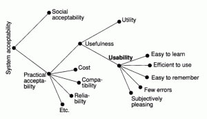
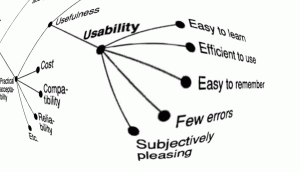
In his textbook Usability Engineering, Jakob Nielsen diagrams software suitability analysis. In the clinical setting – when we are sleep-deprived and frequently interrupted with urgent concerns – usability becomes even more important.
We also learn from Nielsen about performance. If you are an average computer user, once you click something on the screen, you will wait for one (1) second before turning to something else. In a busy clinical setting, you won’t wait so long. Once you turn to something else, your train of thought is derailed, which provides an opening for cognitive error. The role of such distraction in fomenting error is well-recognized in the scientific discipline outlined in James Reason’s book Human Error.
Data Pixels
Design is art and intuition. Usability analysis is sanding.
Alan Cooper says:
To me, usability methods seem like sandpaper. If you are making a chair, the sandpaper can make it smoother. If you are making a table, the sandpaper can also make it smoother. But no amount of sanding will turn a table into a chair. Yet I see thousands of well-intentioned people diligently sanding away at their tables with usability methods, trying to make chairs.
Nonetheless, we will look at a few engineering principles and heuristics that we can use to critique and improve a design.
Using terms from Edward Tufte, we can analyze the ink on a piece of paper – or the pixels on a computer screen – in terms of data ink or data pixels. How many pixels actually convey needed data? How many don’t convey data? What is the ratio?
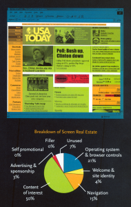
In Nielsen and Tahir’s Homepage Usability: 50 Websites Deconstructed, they analyze 50 home pages, including some of the best-known. They measure screen real estate for multiple categories.
For usability assessment we can do the same, dividing the screen into Tufte’s data vs. non-data pixels, related specifically to the task at hand. An example is lab values: busy clinicians want the essential data without extraneous distractions. For a quick check of a CBC (complete blood count), we don’t need to know the MCV, MCHC, or anything beyond the basic WBC, Hg, Hct, and platelet counts. If we want more information, for example the differential, we are happy to click on a link to find it. (Those cryptic acronyms stand for Mean Corpuscular Volume, Mean Corpuscular Hemoglobin Concentration, White Blood Cell count, Hemoglobin, and Hematocrit.)
The figure shows a laboratory data display from one install of the leading niche ”best-of-breed” EDIS (ED information system) – KLAS overall rating of 8.24. This is the output from the laboratory system, available as a more-or-less unparsed data feed, which is what the lab system at this particular hospital provided to the EDIS. (ED information systems can provide better-formatted lab data, provided they get the proper data feed to parse.)
If we mask pixels not directly related to our immediate needs (seeing the basic CBC) we see data scattered about the page, buried in a mass of data irrelevant to the current task.
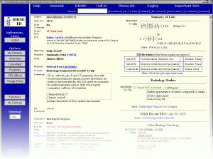
Compare with the dashboard design by Dr. Larry Nathanson of Harvard’s Beth Israel-Deaconess Medical Center. In the Beth Israel example, the lab values are grouped together, so that we don’t have to scan through haystacks of data to find the few needles of data we need. The remainder also shows more information relevant to the acute-care clinician, compared to the laboratory report in the previous two figures, which nonetheless has fewer data pixels related to acute needs. Those with a programming background may see parallels with object-oriented programming concepts of data-hiding and encapsulation.
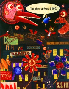
Compare the unparsed CBC results above to the example of my daughter’s puzzle book. Metaphorically, the task is the same – finding a needle in a haystack. Both tasks have high “cognitive friction” (a term we will discuss more later in this series.)
Location
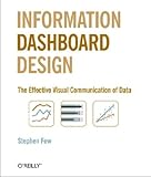
Realtors speak of “location, location, location” and this is also true of a computer screen. Western viewers read the screen in a predictable fashion, giving pride of place to things displayed in the upper left or the center of the screen, shown in the figure, from Information Dashboard Design: The Effective Visual Communication of Data. A simple heuristic is to inspect program screens to see which gets the best places: critical information? a corporate logo? artwork?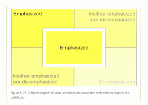
Preattentive Attributes
We can also look into cognitive neuroscience to improve screen design, as discussed in Colin Ware’s Information Visualization Perception for Design. Few’s previously-mentioned Information Dashboard Design presents a précis of the most relevant points of Ware’s text. The following excerpt gives the flavor of Few’s presentation:
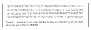
Preattentive processing, the early stage of visual perception that rapidly occurs below the level of consciousness, is tuned to detect a specific set of visual attributes. Attentive processing is sequential, and therefore much slower. The difference is easy to demonstrate. Take a moment to examine the four rows of numbers in Figure 4-1, and try to determine as quickly as you can the number of times the number 5 appears in the list.
How many did you find? The correct answer is six. Whether you got the answer right or not, the process took you a while because it involved attentive processing. The list of numbers did not exhibit any preattentive attributes that you could use to distinguish the fives from the other numbers. Now try it again, this time using the list of numbers in Figure 4-2 .
Much easier this time, wasn’t it? In this figure the fives could easily be distinguished from the other numbers, due to their differing color intensity (one of the preattentive attributes we’ll discuss below): the fives are black while all the other numbers are gray, which causes them to stand out in clear contrast. Why couldn’t we easily distinguish the fives in the first set of numbers (Figure 4-1) based purely on their unique shape? Because the complex shapes of the numbers are not attributes that we perceive preattentively. Simple shapes such as circles and squares are preattentively perceived, but the shapes of numbers are too elaborate.
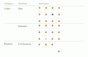
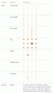
In Information Dashboard Design, Few notes several attributes that can be processed preattentively, as shown in two figures here.
A clever designer could use a combination of these specific elements to preattentively highlight out-of-bounds and panic levels of lab tests, or design preattentively-recognized icons. These would not look like a printer or the Buddha (a common user description of “needs registration” icon in Cerner FirstNet) but would be very quickly recognized.
Tags: Sanding, Tutorial, Edward Tufte, ED Systems, Jakob Nielsen, CBC, Emergency Department, Usability, KLAS, Computers, User Interaction Design, Stephen Few, ED, User Interface, Information Dashboard Design, Alan Cooper, Critical Incident Stress, Colin Ware, Response time, Interruptions, Information Visualization, Information Technology, Performance, Preattentive, Healthcare, Human Error, Dashboard, IT, James Reason, Healthcare IT

