- Usability, Learnability, Memorability
- Tognazinni’s Paradox
- Design Integrity, Simplicity and Abstraction
- Discount Usability Testing
- Personas
- Goals vs. Tasks
- Information Design
- Performance, Data Pixels, Location, and Preattentive Attributes
- Icons, Pedagogic Vectors, Forms Design and Posture
- Mental Models, Input Modes and Cognitive Friction
- Search
- Data Display
Icons and Pedagogic Vectors
We all have trouble remembering a program’s graphical icons. The International Standards Organisation (ISO) has a standard for icons – an icon must be interpreted correctly by 2/3 of test subjects. In usability and error-prevention terms, a 1/3 error rate is poor, but reality is even worse – an experimental study of typical icons showed that 6 of 12 icons could be remembered by knowledgeable users, and new users could guess the meaning of only 1 of 12 icons. (Lindgaard, G., Chessari, J., & Ihsen, E. (1987). Icons in telecommunications: what makes pictorial information comprehensible to the user? Australian Telecommuncation Research, 21(2), 17-29, not available online.)
A vector, in user interaction terminology, is a way to interact with the computer. Common vectors include typing on the keyboard, using the mouse to directly manipulate objects on the screen, using the mouse to click on icons, or using the mouse to navigate a hierarchical menu system.
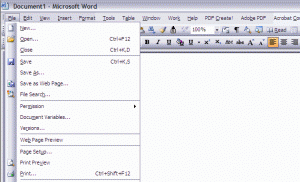
Some programs offer icons as shortcuts that may be used once learned, but all functions are available via a menu system. Microsoft Office applications such as Word and Excel are good examples. Every time we use the menu to pick “File” and then “Print” we see, next to the “Print” menu item, a picture of the little printer icon for this function. So, each time we use the menu system, we are taught what the icon looks like. This “pedagogic vector” helps us learn the icons. Clicking on icons is faster than a menu system, once you’ve learned the icons, but it’s easier to find a function on the menu system if you’re not familiar with the icons.
My experience with about thirty different types of medical software is that none of them offered such a pedagogic vector. “Tooltips” (small popup balloons with text, when the mouse is hovered over an icon) are also commonly used to help users learn icons. Seems to me that few medical software packages offer tooltips, either.
Having a pedagogic vector is helpful. But to be effective, icons themselves need to be both learnable and memorable (discussed in Computers in the ED 1).
While it is important for icons to be learnable, it is most important that they be memorable. When icons are used, as they should be, as accelerators to allow experienced users to move faster than they could by using the menus, memorability is key. If icons are used as the only vector to carry out functions (a practice to be decried!), then learnability becomes even more important.
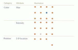
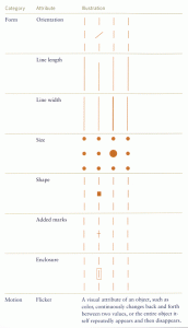
Designing icons for learnability and memorability used to be an intuitive, artistic process. But the research on preattentive processing (discussed in Computers in the ED 8) allows us a scientific way to, perhaps, engineer icons that are at least memorable. We merely have to employ several of the preattentive attributes in the figures to the right from Few’s Information Dashboard Design: The Effective Visual Communication of Data as we create the icons. However, few of today’s program icons take advantage of this cognitive science.
When you are looking at medical software to judge its suitability for your hospital or ED, check to see if it has a pedagogic vector, and hover the mouse cursor over the icons to see whether its icons have tooltips or not. If not, you can assume that, the software will be relatively hard for users to learn and use.
Forms Design
Barnett’s Forms for People: Designing Forms That People Can Use (by far the best book on form design ever written) is full of bits of useful evidence, usable for both paper and computer-input forms. Some are of particular interest to action-oriented information design, particularly standing orders and computer-based practitioner order entry (CPOE). Some are relevant to the display of data, as well.
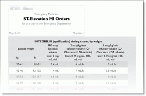
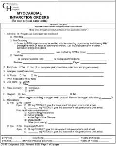
To separate entries in data tables, as with the patient list on most patient tracking boards, Barnett recommends thin dotted lines; Tufte argues for de-emphasizing lines (non-data pixels) by gray tint; but Barnett persuades us that, even better, we should tint alternate lines with background bars of faint gray or a pastel. See the figure from the printed MI orders to the right, or look at the checkbook register of a financial program like Quicken.
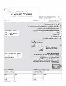
Barnett, Tufte and Nielsen all say to de-emphasize everything except pixels directly relevant to the task at hand. There may be requirements for certain logos or boilerplate text on a page, but decreasing contrast and color saturation of such non-data pixels allows us to focus on what’s important.
The old-style MI floor orders and newer ED MI orders illustrate this. The de-emphasis of non-critical elements helps avoid “sign pollution.”
Posture and Configurability
We can speak of the “posture” of a program, as described by Alan Cooper. A program such as Microsoft Word expects to be in sovereign posture – it expects your full- or nearly-full screen, it expects your nearly-full attention – it’s basically “in your face.”
But other programs, for example a cellular-modem applet for an EVDO Aircard that allows your laptop broadband cellular access, or a media player used for playing music while you’re using the computer for other things, adopt a daemonic posture. These programs try to stay out of your face. They even offer special options, such as minimizing to the system tray, to keep themselves even further out of your face.
ED tracking systems should adopt a different posture: a kiosk or coke machine posture. The soft drink companies want you to be able to, for example, continue a conversation with friends or on your cellphone as you buy a soft drink without error – so coke machines have low cognitive friction (we will talk about cognitive friction more in a later post) and part of this is that they all look the same. We want you to walk up to any computer in the ED and check the tracking screen without error – while you continue your conversation about the tPA or heparin or some other medication dosage.
It makes sense for an ED manager’s office computer to have a customizable tracking display. However, for the busy ED – where the staff tend to be in a constant, almost Brownian motion about the ED, and at one moment, are using this computer, and a few minutes later are using that computer – well, in that case, having customized displays on computers makes little sense.
For walk-up, coke-machine usability, the screens need to look the same. The paper’s author remembers when one major ED tracking system was first marketed, and one of the program “features” that was being displayed was: “You can customize the screen like you want! You can use your mouse to grab the lines between the columns and make a column wider or narrower. You can even drag two lines together to make a column disappear!” Today, this is still a “feature” of this tracking system. But if you walk up to a computer, and the last person to use it has made a column disappear, you may not be able to see the information you need – urgently.
To quote from Alan Cooper:
Leaving the design to the users is the ultimate abdication of the designer’s responsibility to provide a quality product, and many studies have shown that users . . . customize their interface in ways that are detrimental to their productivity.
Hospital Information System (HIS) vendors tend to tout their customizability – which to many in the usability field is code for “we have no idea what good medical work processes are, we’ll just give you a bunch of parts and a few tools and then you’re on your own.” (This is reminiscent of the description of Unix Express in the old alt.folklore.computers message thread about “If computer operating systems were airlines… “)
In the above quote from Cooper, substitute “hospitals” for “users.” How many hospitals have IT staff trained in usability or user interaction design?
Tags: Form Design, kiosk, Jakob Nielsen, Forms for People, ED Systems, coke machine, Usability, icons, Emergency Department, User Interaction Design, vector, Computers, Learnability, pedagogic vector, ED, Memorability, tooltips, Alan Cooper, User Interface, CPOE, Information Technology, Edward Tufte, data pixels, Healthcare, Information Dashboard Design, tinting, IT, Preattentive, posture, Healthcare IT, Dashboard, configurability, Tutorial
