Computers, Medicine, Usability, viewed from the ED
If you're new here, you might like to look through this introduction to the site first.
Are you interested in how computers can reduce medical error?
Did you know that many early medical computer systems increased medical error? (Some current ones, too.)
From your own experience with your own computer at home, do you think that some computers and programs crash on a regular basis? Do you think that most software is hard to use, rude, and frustrating to work with? Based on experience, what you’ve heard, or simple extrapolation, do you suspect that medical computer systems are even worse?
Did you know that the best place to test medical computer systems is the ED, because people working in the ED don’t have the time to deal with bad computer systems, and are intolerant of BS? (If it works in the ED, you can make it work anywhere else in the hospital.)
Do you want to learn more about how to make medical computer systems usable, so as to prevent medical error?
If the answer to any of these questions is “yes,” then read through the Medical Computing series. Although looked at from my viewpoint in the ED, it all applies to medical computer systems wherever they are used, in a hospital, in a clinic or in an office.
If you need a backgrounder on Healthcare IT concepts and terminology, see Healthcare IT in a Nutshell.
There’s also a series of “word” essays that focus on particular and generally more advanced medical computer issues.
To keep up with new postings, you might want to subscribe to my RSS feed.
One final note: Once explained, most of the suggestions on this site seem simple and obvious. But as one is creating a program, or even as one is using a program with a high level of frustration, they are still not obvious until pointed out.
I hope you find the site informative and, perhaps, a bit mind-expandingly entertaining.
Keith Conover, M.D., FACEP
 Let’s suppose it is 1980. Suppose someone shows up in your ED with a fever, and a history of travel to an area with a new plague characterized by fever. The nurse has heard about this on the news, asks the patient about travel to the area, and gets a “yes.” The nurse not only writes this on the paper chart, but tells one of the ED doctors about it. The patient is correctly identified as a possible plague carrier, and admitted into an isolation room.
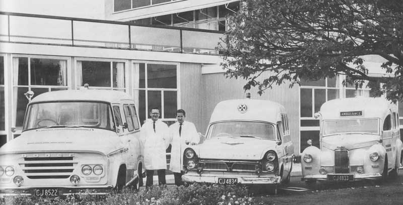
Mid-20th-Century Emergency Room
Let’s now suppose it is 2014. There is a shortage of primary care physicians. Primary care physicians no longer see emergencies, even minor emergencies, in their offices. EDs are much, much busier, and overcrowded. As a way to make things better (and, let’s be honest, to make money), vendors have developed electronic medical record systems (EMRs). Physicians, nurses and other ED staff give these hospital-wide EMRs low grades for usability, but the Federal government has been dangling big bags of money in front of hospital administrators as an incentive to buy an EMR. The government succeeded in persuading hospitals to go ahead full-bore with hospital-wide EMRs irrespective of their poor usability.
Read the rest of this entry »
 Let’s suppose it is 1980. Suppose someone shows up in your ED with a fever, and a history of travel to an area with a new plague characterized by fever. The nurse has heard about this on the news, asks the patient about travel to the area, and gets a “yes.” The nurse not only writes this on the paper chart, but tells one of the ED doctors about it. The patient is correctly identified as a possible plague carrier, and admitted into an isolation room.