I have used speech recognition for my medical charting for decades. Not all that long ago, we switched from Dragon Network Enterprise to Dragon Medical One (DMO). Overall it has been a significant improvement. DMO integrates with electronic medical record systems such as Cerner or Epic at the server level. This brings better recognition and makes it easy to use speech recognition to complete or amend charts from home.
However, one lasting complaint from my partners was the sign-in for DMO. When you start up Cerner or Epic, a separate sign-in dialog pops up. You have to put in your username, and then pick a vocabulary; every time we logged in, we had to change this from “General Medicine” to “Emergency.” Couldn’t we set this as the default and not have to change it each time? Finally, after many months, we heard that it would default to General Medicine for everyone and we should leave it there.
After this, I spoke with someone from our Nuance/Dragon support team about this. He explained it to me this way. Those different choices we had been forced to choose from? They did nothing. Absolutely nothing. It was, as he said, “a placebo button.” The vocabularies that we each were assigned, two of them, were set by Nuance when they set DMO up for us. Neither we nor his support team could affect this, and our prior choice of “Emergency” every time we logged in was totally nonfunctional: it did absolutely nothing. The IT support person told me that that button is still entirely nonfunctional, and so they asked Nuance to remove it. Nuance said that, due to the structure of the system, they couldn’t remove it.
We had discussed data pixels in another post. We also discussed anti-data pixels, things on the screen that distract you from the real data. Well, those pixels where you can pretend to choose a Dragon vocabulary but it does nothing, making you do work that does nothing? Or pixels in some other program that look like they do something but don’t? Or those that entice you into doing the wrong thing,or wandering off into dusty back hallways of the software. And are so enticing that you accidentally click them on a regular basis? Let’s call those anti-user pixels. Perhaps a more formal definition of anti-user pixels might be: “pixels on the screen that have not been removed, because they’re so tightly tied to the underlying code structure that taking them out requires major effort, or other reasons such as corporate requirements, that are not only useless and distract from data pixels but mislead and make a user’s job harder.” I challenge you to report other examples of anti-user pixels, or better definitions, in the comments section.
This relates to some other user interaction design and coding concepts that we can apply (with a little cutting and fitting) to this issue:
- Information Hiding: in this context, if it’s not immediately relevant to the particular user or task, hide it so people can better see the forest rather than the trees, and are less likely to click something that will lead them astray and perhaps lost amongst the trees
- Task/Work Process Analysis: in this context, analyzing users’ tasks and work processes and omitting needless pixels (like Strunk and White’s “omit needless words”), pixels that don’t contribute to the task at hand.
- Discount Usability Testing: cheap and easy ways to test usability of a task or work process using a particular software product. See: https://ed-informatics.org/2009/12/29/computers-in-the-ed-4/
- Encapsulation: in this context, presenting the user with a screen with the most common or best choices for the task at hand; and, hiding rarely or never used choices behind a single or at most a few less-enticing links: basically, keeping information related to the task together in one place and only presenting the user with that information. That requires knowledge and understanding of the various user tasks and work processes; see the two above bullets.
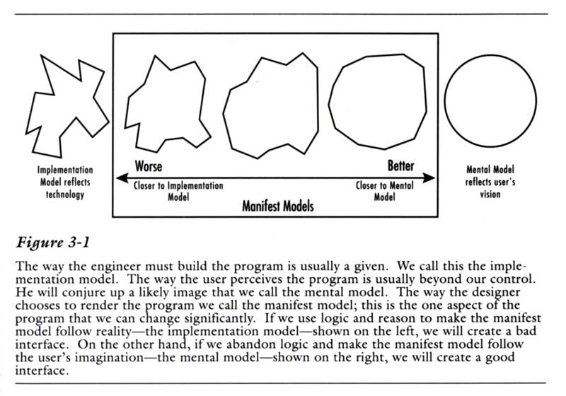
This also relates to an idea, introduced in the first edition of Alan Cooper’s groundbreaking 1995 book About face: The essentials of user interface design. It’s that a user interface should correspond with the user’s mental model rather than the coder’s/programmer’s implementation model.