One important medical computer application (hereinafter “app”) is a PACS system. PACS stands for “Picture archiving and communication system.” (PACS system is redundant, but so be it.). Wikpedia has a nice explanation at https://en.wikipedia.org/wiki/Picture_archiving_and_communication_system.
For emergency physicians, it’s where we usually view X-rays and CT scans, and enter “wet reads” (our preliminary interpretations of X-rays, colloquially named from the days when the actual films came out of the developer still wet). That’s a very important part of our job, and things that make it easier, faster or better mean a lot for us.
“IBM” now just stands for “IBM” rather than “International Business Machines.” I work at UPMC; similarly UPMC now just stands for “UPMC” rather than “University of Pittsburgh Medical Center.” The University of Pittsburgh campus and the multiple UPMC “core” hospitals in Pittsburgh are still the beating heart of UPMC. As I’m writing this, I’ve been working for UPMC or one of its predecessor hospitals for about 40 years, and there have been a lot of changes over the decades.
A recent change at UPMC is to move away from a homebrew-ish PACS system that was called Stentor and then iSite and then ClinicView. I heard it was originally developed by a bunch of UPMC radiologists who were also computer geeks. It was indeed showing its age: it ran only on Internet Explorer 11.
We have had to quit using ClinicView in favor of a new, and for a given value of “better,” better system. Many of us miss ClinicView, because, once you learned it, it worked fast. It wasn’t easy to learn, but once you knew how to use it, it was easy to remember. And zooming in and out, panning around, and changing the “window” (brightness & contrast) was really, really fast.
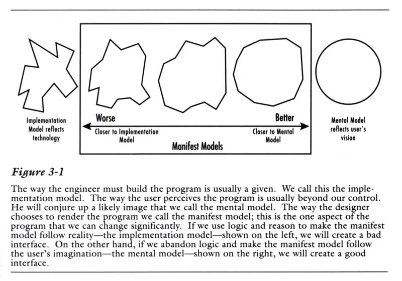
The goal of this post is not to unfairly critique the new system, but to explore the relevant usability issues for educational purposes. So I will call it “PACS Who Shall Not Be Named,” PWSNBN for short. If their UX dweebs (User Experience cognoscenti and designers) learn from this and make their product better, and as a result their company prospers, that’s great!
There are complaints about PWSNBN, at least one of which is not the fault of the vendors. When we first were forced to switch to PWSNBN, it didn’t support CCOW. Pronounced “Sea Cow,” CCOW’s a standard way to communicate between medical apps. CCOW is what allows you to be working in one app looking at one particular patient, and then quickly switch to another app and (a) be signed in as you, and (b) be looking at the same patient’s information. Wikipedia has an expanded but not too geeky or long explanation at https://en.wikipedia.org/wiki/CCOW.
PWSNBN not having a CCOW link to our current Hospital Information System (“HIS”) means that we have to log into it separately from our other CCOW apps. And, login again when it times out. And, once we’re in PWSNBN, we have to search for the right hospital and department. And, search for the patient. But this is not the vendor’s fault: we are in the process of switching from one Hospital Information System to another. Once that happens, and the CCOW interface with the new HIS starts working, we should be able to quickly go back and forth from the new HIS to the new PWSNBN without logging in over and over, or searching for hospital, department and patient over and over.
But this post is about accelerators : things in the user interface/user interaction design that make you faster. Our existing HIS pretty much requires you to keep going back and forth between using the keyboard and using the mouse all the time. Both keyboard and mouse are input modes: different ways to manipulate things on the computer screen. In https://ed-informatics.org/2010/02/11/medical-computing-10/, we discussed switching input modes and how this puts on the brakes: slows us down. To quote from that post’s section Switching Modes, as we’re coasting along the user interaction highway we have to slam on the brakes to:
- move our eyes and our mouse cursor to a search box
- start typing what we want to find
- move our eyes from the search box to the results listbox below to make sure we’ve found the right thing
- take our eyes off the screen and look around for the mouse
- take our hands off the keyboard and move them to the mouse
- return our eyes to the keyboard and find the listbox again
- move the mouse cursor to the listbox, click on the instruction, doctor or medication
Our new PWSNBN minimizes this: if you want to zoom in on part of an X-ray, pan around to look at different parts of the zoomed-in X-ray, or adjust the window (increase or decrease brightness/contrast), there is a buttcon (clickable pushbutton with an icon on it) under the image for each these things. You click on one of the buttcons, then click on the X-ray and move the mouse cursor up or down or left to right to adjust. What’s not to like? No mode-switching! Efficient! Fast! But… you have to take your eyes off the X-ray, find the right button at the bottom, click on it, zoom to the level you want, look back at the buttcons on the bottom, find the one to pan (move) the X-ray, click on it, then move your eyes back to the X-ray to click on it and move it to the right place. And if you need to zoom in a bit more, you need to do this whole procedure again.
In ClinicView, if you click on the X-ray and move the mouse cursor around on the X-ray, you change the window. If you use the mouse scroll wheel, you zoom in and out. If you double-click on the image, you get a fullscreen view.
What about panning? Well, what if you could use the mouse with one hand and the keyboard with the other hand? Combining modes rather than alternating? Could that work? Well, if the hand on the keyboard is just holding down a single key to modify what the mouse does, that would be quite easy.
And indeed, ClinicView has an accelerator key: the Control key. It allows us to even more quickly zoom and pan to zoom in and look at an area on the X-ray, as opposed to the repeated button clicks and drags with the mouse in PWSNBN.
If you want to look closer at something on the X-ray, you hold down the control key, which is your accelerator key. With it held down, the mouse scroll wheel zooms in and out, and moving the mouse cursor pans (moves) the X-ray to the point of your interest. The Control key is now the “zoom and pan to quickly look at a concerning area on the X-ray” accelerator key. And, once you’ve got that portion of the X-ray magnified on your screen, you can take your finger off of the Control key and now drag the mouse cursor left or right and up and down to change the window (brightness & contrast).
Someone had to teach you how to do these things, there was no pedagogic vector (see https://ed-informatics.org/2010/02/11/medical-computing-9/) in the interface to teach you how to do this. But once you learned them, it was easy to remember them. Good memorability but poor learnability. (See https://ed-informatics.org/2009/12/28/medical-computing-1/ for more about learnability and memorability.)
While using the mouse to drag the cursor around the screen, and for that matter using the mouse’s scroll wheel, and at the same time pressing and holding one of those accelerator keys such as Control, Shift or Alt, and using the mouse, you could pan, zoom and change window, sometimes even moving the mouse and using the scroll wheel at the same time. Once you got used to this – and it didn’t take long – it made zooming, panning and window-adjusting easy and enjoyable. Viewing X-rays was a joy. (Indeed, a lot of us still use ClinicView to view X-rays, then switch to PWSNBN to put in our wet reads.)
Once you learn these ways to manipulate the X-ray image in ClinicView, you can improve your view by double-clicking the image to view it fullscreen, and still use the mouse cursor, scroll wheel and control key as before. Fullscreen view is not available in PWSNBN.
PWSNBN could do the same thing, and go ClinicView one better. Those buttcons at the bottom of PWSNBN? When you hover your mouse cursor over them (called a hover state), a little popup window pops up to tell you what the button does: helpful until you learn what the icons mean, and your fingers learn where to click to do different things. (See https://ed-informatics.org/2010/02/11/medical-computing-9/ for more about such pedagogic vectors and tooltips.)
If PWSNBN could offer those accelerator keys, and the tooltips suggested to you how to do it with the mouse, such as “scroll wheel to zoom” “Ctrl+drag = pan”, “Ctrl + scroll = zoom” and “double-click for fullscreen” you would have the best of both worlds. You would have and easy way to learn the system, and once you got the basics down, double-click and then get your finger on that control key accelerator key and press the pedal to the metal.