- Usability, Learnability, Memorability
- Tognazinni’s Paradox
- Design Integrity, Simplicity and Abstraction
- Discount Usability Testing
- Personas
- Goals vs. Tasks
- Information Design
- Performance, Data Pixels, Location, and Preattentive Attributes
- Icons, Pedagogic Vectors, Forms Design and Posture
- Mental Models, Input Modes and Cognitive Friction
- Search
- Data Display
In the first of this series, I tried to persuade you that your computer was human-illiterate, and we defined and discussed usability, memorability, and learnability. In the second, we discussed Tognazzini’s Paradox: how the hardest part of designing an effective program is often what seems the most trivial – sometimes simply a matter of changing a single word.

The Famous View of Fallingwater
Now, we should discuss design integrity, and in particular, simplicity and abstraction.
Integrity is easy to identify, hard to explain. Let me give a few examples and make an attempt at explaining.
First, Frank Lloyd Wright. National and international associations of architects have acclaimed one of his houses the most important building of the 20th century: Fallingwater. Fallingwater, a house he built for the Kaufmann family of Pittsburgh, is the finest example of his “organic” architecture. Wright considered organic architecture to be what is entirely appropriate to its place, its time, and its user. Having Bear Run go through the living room, and building the room out over the waterfall, sounds like an exercise in spectacle. Yet anyone who has been to Fallingwater (something I highly recommend – and while you’re there, also visit his house Kentuck Knob, open for display about 10 miles away – make sure you visit the sculpture gardens by walking about half an hour down the hill to the entrance buildings) can understand that is is actually a very understated house – there isn’t a bit of spectacle. The irregular, staggered horizontal lines of the house mesh with the flat-bedded stone of the Bear Run ravine, and the house seems to be a natural extension of Laurel Mountain’s bones rather than something imposed on the landscape.

Conover House Back View
I strongly recommend that your visit to Fallingwater also include a day-hike in the surrounding Bear Run Nature Reserve, so you can get a feel for Pennsylvania’s Laurel Highlands, the western edge of the Appalachian Mountains and a just lovely area to hike. But be prepared for wet weather – the top of Laurel Ridge to the east is a temperate rain forest. It’s about an hour’s drive from my house in Pittsburgh, which was the house and architect’s studio of one of Wright’s pupils, and for years its renovation has been taking more than all my time, effort and energy, but it at least shows I truly buy into this “organic” idea.

Conover House Great Room from Catwalk
This spirit of “organic” architecture, though it might seem a sideline, is central to the problems of good design for information display, and particularly for ED software. A look at what constitutes “organic” architecture provides important lessons for us.
…organic architecture is honest – it does not lie about anything (therein lies its beneficence when we seek truth; its impudence when we practice hypocrisy). A material used represents itself and no other. Nothing appears to be what it is not. If a material looks like brick, it is brick. If a wall surface looks like tile, it is tile. If a panel looks like wood, it is wood. An asbestos shingle molded to imitate wood grain is not organic architecture. A wooden surface whose grain and quality is covered with paint is not organic architecture. A steel desk grained to look like wood is not organic architecture.
Conover House Great Room from Under Catwalk

–John Lloyd Wright, writing in My Father Who is On Earth: By John Lloyd Wright (about his father, Frank Lloyd Wright)
Wright, in common with the Stickley brothers, furniture designers from the early part of the 20th century, eschewed applied ornamentation and shoddy products of Victorian mass-production. Wright talked of “constitutional ornament” – where the ornamentation was a natural or organic outgrowth of the construction itself, rather than something tacked on later. The mortise-and-tenon joints of a Stickley Morris chair are a classic example.
While some of the British exponents of the Arts and Crafts movement idealized the Medieval craftsman, who built an object from scratch using the labor of a single person, neither Wright nor the Stickleys objected to machine-made items, only to shoddy machine-made items.

Stickley Quadrilinear Post Construction
To find an example of applied ornamentation in current computer program design, simply find a PC that runs WindowsXP. Use the Search feature with its default settings. Take a careful look at the animated dog in the lower left corner.
To find a computer example of “constitutional ornament” is difficult. In computer design, constitutional ornament would be a screen where every single pixel has a function, but the overall structure and design of the screen is itself ornamental. Alas, good examples are hard to find; yet, one may with some justification (despite my desire to participate in the popular sport of Microsoft-bashing) point to some of the screens of Microsoft Powerpoint XP. When editing a slide presentation, one usually sees a slide in the center, a sequential view of the presentation’s slides in miniature along the left. And when one wishes to select another design template, one sees another set of miniature slides of potential designs along the right side of the screen in a “task pane.” While not the computer equivalent of Fallingwater or a Stickley Morris Chair – that’s years away, Apple’s and Adobe’s best efforts notwithstanding – the design nonetheless provides a pleasing yet functional screen that may be considered, with its repeated grid of functional elements, to include constitutional ornament.

Stickley Quartersawn Post Construction
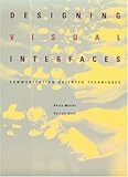
In their classic book Designing Visual Interfaces: Communication Oriented Techniques, Mullet and Sano describe the application of these and other graphic design principles to computer design group them under the rubric of “integrity,” They identify several critical principles to the design of computer screens. In addition to showing examples of good and bad computer screens, they discuss integrity in other fields. Paraphrasing Wright and Stickley, they say that objects constructed from genuine materials are always valued more highly than those that use a cheaper substitute, providing a picture of Shaker built-in cabinetry for illustration. Attempts to make a computer program more user-friendly by adding an animated dog are as bad as “mission” furniture that is held together with staples but emulates a Stickley mortise-and-tenon joint by a glued-on block of wood. When you examine software for your ED (or wherever), look for gratuitously applied ornamentation: decorative square boxes at the corners of a discharge-software screen (thankfully now gone from that vendor’s offerings) or prominent corporate logos on the screens.

Stickley Resawn and Matched Panels
When my wife and I started looking for furniture to replace our student-slum pieces, we studied period design and learned about different types of furniture. We decided that mission-style (arts-and-crafts style) furniture in the Stickley mold was what we wanted. Solid, not particularly vulnerable to cats, dogs or young kids, and will age gracefully, even if a bit more expensive than other equivalent furniture, and didn’t look all that comfortable. At first furniture store we went to in Pittsburgh, we actually found “mission” furniture with glued-0n blocks of wood to simulate “mortise and tenon” joints – the salesman said that real mission-style furniture is so expensive to create that nobody made it any more. We left in disgust and despair, because we’d looked for Stickley furniture only to find that they were all antiques, like the Stickley sideboard Barbra Streisand paid $363,000 for in 1988. But then we found that Gus Stickley’s furniture factory never quite went out of business, though it was a pale shadow of what he and his brothers had set up almost a century ago, and didn’t make Mission-style furniture any more. Lucky for us, it was bought by the Audi family, who were Stickley enthusiasts, and they had put all their life’s savings into renovating the factory, and it was now turning out true Stickley arts-and-crafts furniture again. Over the years, we slowly bought new pieces of Stickley furniture – as the salesman pushing the glued-on blocks said, it was more expensive than cheaply-made items, but maybe only a third more. Now, except for a few Colonial heirlooms, our house is furnished in Stickley pieces, made pretty much the way they were a hundred years ago. To see examples, Google “Stickley,” and check out stickley.com.
On a sideline, a local Stickley dealer once arranged a bus tour of the area, near Buffalo, NY, that was a hotbed of arts-and-crafts design and production around the turn of the last century, and we got to see the modern Stickley factory – large, brightly lit, and with the latest machinery from Switzerland, but still also with crafts-men and -women hand finishing the pieces – and the original factory, being turned into a museum, with some of the furniture that Gustav Stickley made for his own home.
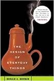
Mullet and Sano give examples of design integrity from other disciplines, including the kanban signs that adorn traditional Japanese shops; shop owners devote much time and effort to the design of these signs, which traditionally embody the virtues of shibui (subdued beauty) and wabi (elegant simplicity). For the virtues of abstraction and simplicity in the graphic arts, they show the map of the London Underground. In this much-emulated staple of graphics design classes, all rail lines are constrained to 45° angles, and outlying lines are compressed to show sequence but not distance. They suggest that, to evaluate a program’s screens, you should look for clues to poor design, such as explanatory text for what should be obvious by the screen’s design, or the need for careful training to be able to use the program effectively. As Donald Norman, in his classic book The Psychology of Everyday Things (later reissued as The Design of Everyday Things), remarks about a door that has a pull-type handle with lettering saying “PUSH”: “A door that requires a user manual, even a single-word user manual, is a design failure.” Similarly, a program that requires a user manual is a design failure.
Enough for now. Next time, we’ll start talking about “discount usability engineering” (Nielsen).

Tags: abstraction, ED Systems, Fallingwater, Computers, London Subway Map, ED, London Underground Map, Usability, Design, User Interaction Design, User Interface, Frank Lloyd Wright, Stickley, Design Integrity, simplicity
