- History, How Bad Design Kills, Posture and Metaphors
- Interruptions, Memory and Situational Awareness
- The Magic Number 7 (or maybe 4?), Forced Errors, Triage, and Color-Blindness
- Where is my [fill in the blank]? and Passive Tracking
- Information Design 2
- Lessons from Tufte
- Natural Mapping, Search and Affordance
Most users (myself included) spend most of their time in front of a computer in a kind of fuzzy autopilot mode, and anything that creates ripples on that placid lake of unawareness is going to be noticed as a disproportionately significant problem.
–David Harris, creator of Pegasus Mail
In Icons, Pegagogic Vectors, Forms Design and Posture, I said
ED tracking systems should adopt a … kiosk or coke machine posture. The soft drink companies want you to be able to, for example, continue a conversation with friends or on your cellphone as you buy a soft drink without error – so coke machines have low cognitive friction … and part of this is that they all look the same. We want you to walk up to any computer in the ED and check the tracking screen without error – while you continue your conversation about the tPA or heparin or some other medication dosage.
Current computer displays, though improving, are of a much lower resolution than that of a well-printed page, by an order of magnitude.
Tufte points this out: when presented with a high-resolution graphic, like a detailed map, we can distinguish down to the 0.1 mm level. For instance, the screen used for printing Tufte’s book is very fine. I did some calculations, and my 1280×1024-resolution 19″ computer screen should have about 3.4 pixels/mm. Measuring on the screen with a fine ruler and a magnifying glass, I can indeed see 3-4 very-blurry pixels per mm. But looking similarly at the halftone screen of a figure on page 27 of Tufte’s Envisioning Information, I can count some 20-30 dots per mm. So my little experiment confirms nearly a 10-fold difference in print and screen resolution. As higher-resolution displays such as the Amazon Kindle arrive, resolution of computer displays is improving. But the Kindle, with 150-167 PPI (pixels per inch) still only has about 6 pixels/mm – about twice as good as my 19″ “high-resolution” monitor, but still significantly below high-quality printing.
But even inexpensive graphics cards offer 32-bit or “true” color. This allows a much wider gamut of color than is available on a printed page. And, with sophisticated drawing programs, it is possible to anti-alias pixels on the screen, finely adjusting color and intensity of pixels to simulate a higher resolution. A computer screen presents the graphical designer with a smaller canvas and a larger palette of colors. But the principles developed for the printed page – and refined over several centuries of printing – may be used to design an effective computer display.
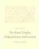
And for the display of data on the printed page, no name or books are more prominent than those of Edward Tufte. His four landmark books, The Visual Display of Quantitative Information, Envisioning Information, Visual Explanations: Images and Quantities, Evidence and Narrative, and Beautiful Evidence form the core of this literature.
In this post, we will apply several of Tufte’s lessons to ED tracking systems. And, remember, as he says himself, that wherever he speaks of “data-ink” or “non-data-ink” you may think “data-pixels” or “non-data pixels.”
First, in Visual Display, he presents his basic ideas of graphical excellence:
Graphical excellence is the well-designed presentation of interesting data—a matter of substance, of statistics, and of design.
Graphical excellence consists of complex ideas communicated with clarity, precision, and efficiency.
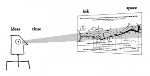
Graphical excellence is that which gives to the viewer the greatest number of ideas in the shortest time with the least ink in the smallest space.
Graphical excellence is nearly always multivariate.
And graphical excellence requires telling the truth about the data.
Next, his ideas about data-pixels and non-data-pixels:
Maximizing the Share of Data-Ink
The larger the share of a graphic’s ink devoted to data, the better (other relevant matters being equal):
Maximize the data-ink ratio, within reason.
Every bit of ink on a graphic requires a reason. And nearly always that reason should be that the ink presents new information. …
The other side of increasing the proportion of data-ink is an erasing principle:
Erase non-data-ink, within reason.
Ink that fails to depict statistical information does not have much interest to the viewer of a graphic; in fact, sometimes such nondata-ink clutters up the data, as in the case of a thick mesh of grid lines. …
Small multiples reflect much of the theory of data graphics:
For non-data-ink, less is more.
For data-ink, less is a bore.*
*The two aphorisms on the meaning of “less” are, respectively, credited to Ludwig Mies van der Rohe and to Robert Venturi, Complexity and Contradiction in Venturi, Complexity and Contradiction in Architecture (New York, second edition, 1977), p. 17
This has a parallel in Strunk and White’s famous maxim: Omit needless words.
Tufte goes on to say:
The same ink should often serve more than one graphical purpose. A graphical element may carry data information and also perform a design function usually left to non-data-ink. Or it might show several different pieces of data. Such multifunctioning graphical elements, if designed with care and subtlety, can effectively display complex, multivariate data. …
The principle, then, is:
Mobilize every graphical element, perhaps several times over, to show the data.
However, he then cautions:
The complexity of multifunctioning elements can sometimes turn data graphics into visual puzzles, crypto-graphical mysteries for the viewer to decode. A sure sign of a puzzle is that the graphic must be interpreted through a verbal rather than a visual process. …
By contrast, in a non-puzzle graphic, the translation of visual to verbal is quickly learned, automatic, and implicit —so that the visual image flows right through the verbal decoder initially necessary to understand the graphic. As Paul Valery wrote, “Seeing is forgetting the name of the thing one sees.”
Of particular relevance to ED tracking systems is his idea of three viewing depths:
Graphics can be designed to have at least three viewing depths: (1) what is seen from a distance, an overall structure usually aggregated from an underlying microstructure; (2) what is seen up close and in detail, the fine structure of the data; and (3) what is seen implicitly, underlying the graphic—that which is behind the graphic. Look at all the different levels of detail created by this population density map of the United States, a glory of modern cartography prepared by the Bureau of the Census. Each dot, except in urban centers, represents 500 people. Note the corridors connecting the major urban complexes; the effects of landforms on the population distribution (the central valley of California, the valleys and ridges of Appalachia, and the clusters along rivers); and the small towns along the highways, linked like a string of pearls. The map arrays. in effect, some 400,000 points on its implicit grid.
Note that the graphic linked here is not, as similar graphics online purport to be, a nighttime satellite view of the USA. It is a carefully-drafted information graphic that simulates a nighttime view of the USA. The graphic linked here, unfortunately, is a pale, low-resolution imitation of the 1970 census map that is gloriously reproduced in full resolution across a two-page spread in Tufte’s book.
The equivalent for a tracking system is to be able to walk into the ED, glance across the nurses’ station to one of the PCs that is displaying a tracking screen, and to get an overall feel for how the ED is doing. My first experience with this was many years ago at the University of Virginia. They had one of the earliest ED tracking systems, written in Visual Basic by a GI fellow who moonlighted in the ED and was a gifted programmer. There were different colors for “need attention by a nurse” (green) and “need attention by a doctor” (red). Certainly these are two of the most critical things a tracking system can tell us. The overall color tint of the screen from across the room, mostly-red or mostly-green – even though you couldn’t see any details – could tell you whether the department was short (compared to demand) on nurses (green) or doctors (red); and when there was a lot of green and a lot of red, like a Christmas decoration – the department needed help of both kinds.
A good tracking system will be consciously designed to work like this. This is not the same as having a little green, yellow or red dot on the screen for the NEDOCS score – nobody could see that dot from across the room. This overview level of information emerges from the overall appearance of the screen. Designing a screen to give different information at different scales is elegant but exceedingly hard. As discussed in Healthcare IT – Educate Yourself, I am emphasizing how hard this is so it stimulates the competitive instincts of the coders – homo logicus – out there.
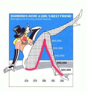
In Envisioning Information Tufte discusses decoration applied to data graphics, which he terms chartjunk:
Chartjunk has come to corrupt all sorts of information exhibits and computer interfaces, just like the “ducks” of modem architecture:
when Modem architects righteously abandoned ornament on buildings, they unconsciously designed buildings that were ornament. In promoting Space and Articulation over symbolism and ornament, they distorted the whole building into a duck. They substituted for the innocent and inexpensive practice of applied decoration on a conventional shed the rather cynical and expensive distortion of program and structure to promote a duck. It is now time to reevaluate the once-horrifying statement of John Ruskin that architecture is the decoration of construction, but we should append the warning of Pugin: It is all right to decorate construction but never construct decoration.*
*Robert Venturi, Denise Scott Brown, and Steven Izenour, Learning from Las Vegas (Cambridge, 1977), p. 163.
The equivalent of chartjunk in a tracking system is a prominent hospital or vendor logo, or applied ornamentation that contributes nothing to the data needs of the users; or, of items used elsewhere in the hospital but seldom if ever used in the ED. I have seen a few ED discharge instructions packages with applied ornamentation – which I am happy to report is now gone in current incarnations. But I see, all the time, ED tracking systems from HIS vendors that are cluttered with things of little relevance to the ED workflow.
A tracking system’s main challenge is to fit a massive amount of complex information on a single computer screen, so consider the following quote from Envisioning Information (think computer screen instead of piece of paper):
Showing complexity is hard work. Detailed micro/macro designs are difficult to produce, imposing substantial costs for data collection, illustration, custom computing, image processing, production, and fme printing—expenses similar to that of first-class cartography (which, in the main, can be financed only by governments). The conventional economies of declining costs for each additional data bit will usually be offset by a proliferation of elaborate complexities provoked by the interacting graphical elements. Still, a single high-density page can replace twenty scattered posterizations, with a possible savings when total expenses are assessed (data collection and analysis, design, paper, production, printing, binding, warehousing, and shipping). And our readers might keep that one really informative piece of paper, although they will surely discard those twenty posterizations. …
What about confusing clutter? Information overload? Doesn’t data have to be “boiled down” and “simplified”? These common questions miss the point, for the quantity of detail is an issue completely separate from the difficulty of reading. Clutter and confusion are failures of design, not attributes of information. …
Among the most powerful devices for reducing noise and enriching the content of displays is the technique of layering and separation, visually stratifying various aspects of the data.
Effective layering of information is often difficult; for every excellent performance, a hundred clunky spectacles arise. An omnipresent, yet subtle, design issue is involved: the various elements collected together on flatland interact, creating non-information patterns and texture simply through their combined presence. Josef Albers described this visual effect as 1+ 1 = 3 or more, when two elements show themselves along with assorted incidental by-products of their partnership—occasionally a basis for pleasing aesthetic effects but always a continuing danger to data exhibits.* Such patterns become dynamically obtrusive when our displays leave the relative constancy of paper and move to the changing video flatland of computer terminals. There, all sorts of unplanned and lushly cluttered interacting combinations turn up, with changing layers of information arrayed in miscellaneous windows surrounded by a frame of system commands and other computer administrative debris.
*Josef Albers, “One Plus One Equals Three or More: Factual Facts and Actual Facts,” in Albers, Search Versus Re-Search (Hartford, 1969). pp. 17-18.
Related to these ideas, future posts in this series will build a tracking system screen from the ground up, with relevant concentrated but easily-accessible information.
Icons, Pegagogic Vectors, Forms Design and Posture
Tags: User Interaction Design, ED Systems, User Interface, Emergency Department, Tracking System, Computers, Edward Tufte, ED, Information Technology, Healthcare, IT, Healthcare IT, Tutorial, Usability
