Make things visible: bridge the gulfs of execution and evaluation.
Use technology to make visible what would otherwise be invisible, thus improving feedback and the ability to keep control.
–Donald A. Norman, The Design of Everyday Things
Norman states: Mapping is a technical term meaning the relationship between two things, in this case between the controls and their movements and the results in the world. [He goes on to describe the mapping of a car’s steering wheel to its direction of travel.] Natural mapping, by which I mean taking advantage of physical analogies and cultural standards, leads to immediate understanding.
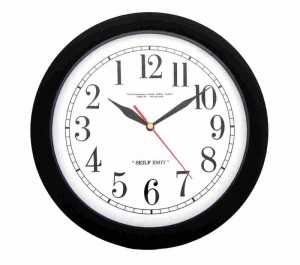
In his landmark The Design of Everyday Things, Norman gives examples of the relationship of stove burner controls to the burners. Later in the book, as an example of an unnatural mapping, he gives an example of a clock whose numbers run counter-clockwise.
A tracking board is a map of the ED. The mapping can be natural or unnatural.
For example, some tracking boards allow one to click on the top of the “Patient Name” column, thence sorting the entries by name. This name-mapping is useful in certain limited circumstances, such as finding a patient by last name.
However, it breaks the “kiosk” or “Coke machine” posture that an ED tracking system should observe: since many people may use a single PC’s tracking display, as a rule it should always look the same. Anyone, even someone new to the ED, should be able to walk up to any PC with a tracking display and use it without having to reconfigure it. If anyone can change the tracking display, it should automatically revert back to the standard display configuration.
When a consultant comes to the ED and says “Didn’t you have a patient named Smith for me to see?” then anyone should be able to use the tracking board to find the patient named “Smith.”
A standard way to do this is to click on the column header for “Last Name” which then sorts the entries by last name – it’s a simple matter to scan down this alphabetical list to “S.” This does destroy the natural mapping of the spreadsheet, so after a short time, the alphabetical sort should go away and the spreadsheet should resort by room number.
Instead of the “spreadsheet metaphor” sort-by-name approach, it would be better to have a search box that provides a list of patient names, sorted by frecency, also with sound-alike variants of the name.
Or, what if a consultant comes to the ED and says “Didn’t you have a patient for me to see? I have no idea what the name was.” In this case, there should be a search box for consultant consults, so you could enter the consultant’s name and then find which patient the consultant was asked to see. The results of this search should also show patients recently admitted from the ED, and to which unit the patient was admitted.
Most every ED uses a mapping like a clock the rooms are numbered in a sequence around the exterior of the ED. But unlike the backward clock above, in areas that primarily use English or Latin languages it’s standard to have these numbers run clockwise around the ED, as we are used to reading from left to right. Most every tracking board, whether a dry-erase board or a computer tracking screen, order their entries in numerical order, corresponding to the clockwise numbering of physical rooms.
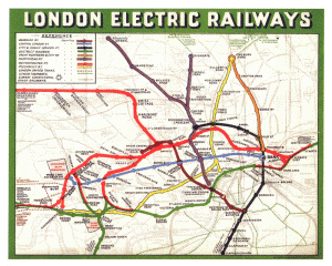
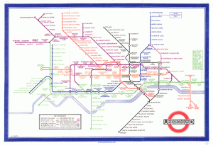
In some ways, this is as much a natural mapping as a true geographic metaphor that shows an actual map of the ED. Compare with maps of the London underground. The original map showed all the twists and turns of the rail lines. But the first major revision by Harry Beck used the principles of abstraction and simplicity to confine the colored rail lines to 45 degree angles, and to compress the outlying stations into a simple and uniformly-spaced sequences, producing what has (rightfully) become an icon of good design.
Similarly, a whiteboard/spreadsheet metaphor of the ED takes long strings of numbered rooms and straightens them out, then sticks them on the left side of the spreadsheet. So the numbers on a spreadsheet-metaphor tracking display are a natural mapping, and use abstraction and simplification just like the London Underground map.
Certainly, a tracking system can use an actual map of the Emergency Department – a number of EDISs do this; MedHost, which was derived from restaurant-map software used in the restaurant business, was and still is one of the great proponents of maps of the ED. In the User Interface (UI) business, this is known as a geographic metaphor. As Count Alfred Korzybski reputedly said during his formulation of general semantics: the map is not the territory. But a geographic metaphor is a bit closer to the territory than a spreadsheet in room-number order.
Other than being prettier, is there any advantage of a geographic metaphor for displaying ED tracking data? I am aware of no research on the topic. Indeed, there is criticism that a map display wastes too much space compared to a spreadsheet.
I know many places that use Amelior ED Tracker, and they seem to be about evenly divided between using the spreadsheet and using the map. Perhaps this is because their map and their spreadsheet seem to be about equal in terms of good design.
A clever map can, as Edward Tufte has shown us, show an impressive density of information, as for example with Minard’s map of Napoleon’s march to Moscow in 1812. And, for the display of data, Tufte emphasizes the advantages of using small multiples – seemingly an ideal application for ED tracking software. One would hope that we can get better at designing ED tracking software, by using these principles and others such as preattentive recognition as discussed in Computers in the ED 8, we will produce a geographic metaphor that is immediately readable but very information-dense.
Such an advanced display would also provide different information at different levels. For example, an early tracking system at the University of Virginia (which I saw there in the late 80s or early 90s, built in Visual Basic by a GI fellow who moonlighted in the ED) used red when a patient needed to be seen by a doctor, and green when the patient needed a nurse (or maybe it was the other way around). When you walked into the ED, if the monitors across the room looked mostly green, the ED needed another nurse to help, and if red, another doctor; if there was a lot of both, I guess it meant a normal Monday (most big EDs see many more patients on Mondays than any other day of the week). Any advanced tracking system should provide levels of display like this – from a distance, you can learn certain things; from being close to the monitor, other things; and by running a mouse over certain items, or clicking them or touching them with a finger, more detailed information.
Affordance
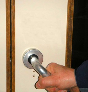
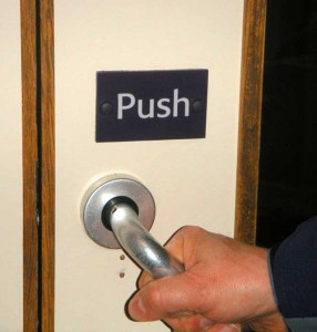
Whilst staying at the hotel at the airport in Glasgow, Scotland (sorry, writing about the UK causes an irresistible urge to use “whilst”) , I walked to the exit door. I was hurrying. I was encumbered by a heavy pack and a duffel bag in one hand. I grabbed the door handle, turned and pulled. I pulled a tendon in my elbow when the door didn’t open.
Why did I pull? Because the handle just cried out to be pulled. Its affordance says “pull me!” It’s just the right shape to twist and pull.
I looked closer at the door. In my hurry, I hadn’t noticed the sign: “PULL.” To which I shouted a line from Norman’s book:
A door that requires a user manual, even a one-word user manual, is a design failure
–Donald Norman
The computer equivalent would be to have underlined text, or a button, or a tab, no matter whether you left-click, right-click, double-click, touch the screen with your finger, or punch the screen with your fist (I saw one of my partners do this once – luckily, no damage to monitor or fist), it does absolutely nothing. Things that look like the want to be clicked – buttons, tabs, and blue underlined text – or items that glow or brighten their colors when you run your mouse over them – have an affordance that virtually invite you to click on them with a mouse.
As with door handles, a tracking system that requires a user manual, or more than minimal user training, is a design failure. For example “you can click almost anywhere on the screen, so we don’t need mouse-over highlighting to indicate that you can click on things” (Wellsoft) is a way to rationalize avoiding the programming effort to work mouse-click affordance into the product.
Other design failures a harder to explain, such as having link text that isn’t underlined, don’t look like buttons or tabs, or anything that can be clicked, which you have to click on to find your incomplete charts (McKesson HPF)
The doctor who was one of the founders of MedHost often expressed the opinion that his tracking screens should not be put in front of chair. (This was before they added physician charting.) He said that if people had to sit down to use his product, it was a design failure. People should be able to walk by, look at the screen and maybe touch it a couple of times with their fingers, then walk on their way. Certainly such usability is ideal, but requires clever design, liberal use of affordance as described above, and clever integration of preattentively-processed visual elements, as described in Computers in the ED 8.
In a book with the intriguing title Turn Signals Are The Facial Expressions Of Automobiles, Norman points out the impressive parallels between design and evolution. We think of design as guided through conscious, carefully crafted attempts to improve upon what has gone before. Yet, as he points out, design is a slow, laborious, trial-and-error process; not exactly parallel to evolution, but, given time and budget constraints of design products, much more like evolution than non-engineers usually think. And, taking the idea of design as (a kind of) evolution, he points out that our devices, including computer programs, will evolve “facial expressions” – indications of the internal state of the program or device. (Rereading this, I can’t help thinking about the Windows Blue Screen of Death and thinking that maybe Microsoft should instead show a cartoon face with crosses for the eyes. )
)
In the case of an ED tracking system, the facial expression of a tracking system could be the “layer” of the display (see the discussion of Tufte’s principles for graphic presentation of data in ED Tracking Systems Part 6: Lessons from Tufte) that shows the overall state of the ED. For instance, when, from a distance, the tracking system looks to have an overall neutral color, that might indicate the ED’s processes are flowing smoothly. Or, when there are lots of strident colors, it might indicate that things are not going so well, and management and staff would do well to look to measures to improve flow. The University of Virginia system I discussed in Tracking Systems Part 6: Lessons from Tufte did this as a byproduct of its design, but a truly clever design for a tracking board would consider this “facial expression” and design it into the system.
I’d like to end with a couple of quotes from the above Donald Norman book:
The phrase “human interface” refers to the part of the technological system that interacts with the person – the knobs, lights, meters, hears, computer displays, buttons, and pointing devices that form the “interface” between machine and human. In this area of applied research, my colleagues are fond of bemoaning the slow rate of progress, casting jealous eyes upon other design areas. Interface design is especially difficult, goes the complaint, because it involves the human, and science doesn’t know enough about human characteristics to make design involving human capabilities into a science. “Oh, give us a few hundred years and maybe we will have firm, reliable design laws, but not yet. If only our field were as advanced as, say, bridge design, the world would be a better place.”
Hah! The good news is that we actually do know a lot about how to design things appropriately for use by people. Moreover, most things designed for human use, especially electronic and computer devices, are so bad that it doesn’t take much knowledge to make dramatic improvements. The problem is that the people who do these designs are often untrained as designers and insensitive to the needs of the people who use them.
Speaking of instrument panels and PC-based monitoring systems, Norman says:
Lights tell us whether a device is turned on, meters and other indicators tell us of the current state, buzzers and alarms tell us when something is wrong and needs immediate attention. No social protocols, no etiquette. No checking to see whether we are busy at some other activity, usually not even a check to see if other alarms or warnings are also active. As a result, when there are serious difficulties, all the alarms and warming scream in their self-centered way, the simultaneous array of lights and sounds impeding intelligent actions by the operators of the system. In places that have large control panels, such as industrial control room, commercial airplanes, and even the hospital operating room, the first act or the human operators is to shut off the alarms so that they can concentrate upon the problem. Unfortunately, the machines have no way of learning form the experience-you can’t spank them and send them to bed, nor is there the equivalent of a note to the parent. As a result, when trouble next strikes, the same rowdy behavior reappears.
I am reminded of the cardiac monitor systems installed in many EDs. Despite the fact that cardiac monitoring has been found basically useless for detecting cardiac arrest (Hollander 2004), the manufacturers are frightened of liability and insist that the monitor alarms are set so they go off all the time. At one particular ED, the ED administration put the terminal with monitor readouts at the desk where the internal medicine admitting residents sat (not in front of a nurse who, theoretically, would be watching the monitors continuously for signs of cardiac arrest). This was disruptive, as the medical residents couldn’t hear their attendings on the phone due to the clamor from the cardiac monitors. This was, however, solved by some of the emergency medicine attendings teaching the medical residents how to disable the monitor alarms.
Later, a new and supposedly better cardiac monitoring system was installed. This one did not allow users to disable the monitor alarms, or even turn down the sound (again, concern about liability). This was quite disruptive. Soon after installation, however, it became less disruptive – and several years later, it was found that the speaker behind the monitor terminal was encased in several layers of adhesive neoprene that muffled the sound quite nicely.
… machines are still stuck in the asocial world of isolated devices. Worse, they have no manners. If machines operate in isolation with no need for interaction with people or other machines, then the lack of social graces and feedback about their internal states can be excused. But when machines are intended to operate with people, then the lack of socialization can lead to difficulties. We call such behavior in people “spoiled,” “arrogant,” or “insensitive,” but somehow we have accepted it from our machines. It is a sign of our technological era, of course, that elaborate handshaking protocols and other social niceties have been developed to handle the interactions among machines, but that no such civility seems to have become standard for the interactions between machines and people.
Tags: Affordance, Computers, Donald Norman, ED, ED Systems, Emergency Department, frecency, Healthcare, Healthcare IT, Information Technology, IT, London Underground Map, mapping, natural mapping, Search, User Interface


