The Whorf-Sapir hypothesis says that our language shapes how we think. It’s been moderately debunked in recent decades, but it’s likely true, at least in small part. And one of those small parts is when someone coins a new word that encapsulates a new idea. There has been a debate within philosophy since Plato’s time about whether words (names) – such as “circle” – correspond with some sort of actual ideal thing in some abstract realm – such as the one ideal circle of which our best drawn circles are only a pale imitation. Plato said yes, establishing the philosophical school known as Realism: “real” in this case means that there really, truly is an ideal circle somewhere out there. Nominalism says no, that “circle” is just a name, but Conceptualism, thanks to Peter Abelard, says that “circle” refers to something real, but that what’s real is about “circle” is that it’s a concept held in our brains. (If you’re a philosopher, I apologize for the gross oversimplification; but I’m a scientist, and as Bacon said: We are more likely to reach the truth through error than confusion.) And coining a new phrase can do just that – create new concepts in our brains. And that can change how we think about things.
And if all those corporate executives who are responsible for our medical software were to get one particular concept into their brains, all of us in the medical field would find our lives a lot easier and error-free.
Cognitive friction is that term, coined by Alan Cooper in The Inmates Are Running the Asylum: Why High Tech Products Drive Us Crazy and How to Restore the Sanity.
It’s quite simple. If you make a process cognitively easy, we do it rapidly and without error. If you make it cognitively hard, it takes us longer and we make mistakes.
And we know how to make things cognitively easier – how to lubricate software to reduce cognitive friction. At least, the information is out there, no matter that most medical software vendors are blissfully unaware of it.
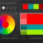
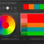
There are many, many things that contribute to cognitive friction. In the essay on Color, we learned how color can be used to guide us through a series of computer screens by directing us to the most likely thing that we should click.
In Mental Models, Input Modes and Cognitive Friction we learned about central (foveal) vision, which subtends only a six-degree field of view. We learned that our subjective impression that we can see an entire computer screen is a total illusion, and that we have to (unconsciously) scan computer screens to find things on them.
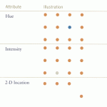
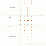
Unless, that is, the things on the computer screen are tagged with characteristics that are preattentively recognized – characteristics such as shown in the first and second diagrams in Performance, Data Pixels, Location, and Preattentive Attributes.
We learned that switching modes – moving from mouse to keyboard – increases cognitive friction.
We also learned that computer response time is important – if the computer makes you wait for more than a second, at any time, then your attention wanders, which of course is not just cognitive friction, it’s more of a cognitive full-stop.
But here, I wish to concentrate on the big-menu effect. When you’re going out for dinner, it’s easier and faster to make a choice from a one-page menu than from a six-page menu. Unless you’ve been there many times before, and know exactly what you want and where to find it on the menu – which is the same way we finally manage to work around poorly-usable medical computer systems with experience and regular practice.
Too much information – too many choices – can paralyze. Trying to find the right choice from fifty alternatives is more than ten times more difficult than choosing from three alternatives. This is true whether it’s on a menu, in medical decision-making, as reported in Donald Redelmeier and Eldar Shafr’s 1995 study, or a cluttered computer screen.
My favorite example of this is from one of the books my daughter had when she was just a bit beyond being a toddler, which was chock-full of visual puzzles. If you’re developing your cognitive abilities as a toddler, such a page can focus your attention and provide an engaging exercise for an hour or so. However, the many medical computer screen pages that mimic this puzzle page are less suitable for rapid, effective use by busy, distracted, and sleep-deprived medical professionals.
So what is the solution? Follow the advice of Strunk and White: “Avoid needless words.” And follow that up, for the computer screen, following the precepts of Edward Tufte and Neilsen and Tahir, with “Avoid needless pixels.”
This is easy to say, but if you’re a computer coder or designer, not that easy to do. The main requirements for low cognitive friction are to design the program, ideally using the persona approach, looking at the work process of the most common users (doctors, nurses, secretaries, respirator therapists, x-ray technician, and the like) and designing screens to closely map their work processes. And, for each of these users, the program must allow users to create a mental model of what the software does; users must never be “lost” in the program.
Here is my summary on how to grease computer screens to minimize cognitive friction.
- Limit the Choices:If a screen has 50 different clickable links or buttons to choose from, redesign to hide most of them behind a top-level choice.
-
No Corporate Logos: If you have to put a corporate logo on a computer screen or you will get fired, do your best to (1) make it smaller, and (2) make it low-contrast and use dull, unsaturated colors. If you have a choice, put it at the bottom right, where it is less likely to attract attention. As far as the user is concerned, these are totally useless pixels, about as helpful as one of those new LED billboards right across from your bedroom window.
-
Group Related Items: if there are bits of information on a screen that need to be seen together to make sense, make sure that they are within the 6-degree view of foveal vision. A classic example is the main elements of a complete blood count: white blood cell count, hemoglobin, hematocrit, and platelet count. These items, plus the patient name and date and time should all be within foveal vision range.
-
Guide with Color: Color can guide users through screens, just like hospitals used to have colored lines on the floor that led to different parts of the hospital (Why did they get rid of those? They were a brilliant idea, just like the London Underground Map but in real life!) Complementary color highlighting of the most commonly clicked items on a page help users mentally automate common processes. If you have to have different types of users using the same screen but frequently choosing different options, consider a triadic color scheme, with a background color and then two other colors, one for each type of user. (A tetradic color scheme, with background and three colors, is stretching it a bit.)
-
Keep User Attention From Wandering:Keep response rates well under a second. Any common computer task that has any delay more than 3/4 of a second anywhere in the process is simply unacceptable and will lead to error. Hardware is cheap, throw enough hardware at the system to keep it responsive.
-
Use Preattentive Features: We all hate flashing website ads, because flashing is a preattentive attribute we simply cannot ignore (if it gets through AdBlock, I hold my hand over the offending area of the screen). Use flashing only to indicated something truly catastrophic, perhaps your “incoming missile alert.” But subtle highlighting with less-obvious preattentive attributes, especially on information-dense tracking displays, can improve the usability of these displays by many magnitudes. For example, with rare exceptions, every clickable item needs to be in blue and underlined, or look like a button.
There are other rules for good design – some of which are covered in other posts on this website – but the six rules above are the major ones apparent to me, at least at this particular instant. If you’d vote for another principle to be given such high-level status, please post a comment.
Tags: Alan Cooper, Cognitive Friction, Computers, ED, ED Systems, Healthcare, Healthcare IT, Human Error, Information Technology, IT, Usability, User Interaction Design, User Interface


