What’s in a word? That which we call a rose
By any other name would smell as sweet.
Romeo and Juliet (II, ii, 1-2)
OK, I cheated. I changed “name” to “word.” It sounded better for the purposes of this essay, which is about the need to choose words carefully. Yes, I changed a word of The Bard’s, and for the worse. So sue me. It makes the point.
This blog is about the usability of medical software. So I am going to offer a real-life example where the choice of a single word can have a major effect on usability.
I have discussed this idea that “one word changes everything” before. If you have read the series on Medical Computing, you will remember that the second essay was on Tognazinni’s Paradox, where usability testing showed that changing a single word on the screen made a massive difference in the usability of Apple’s introduction to the Apple II computer.
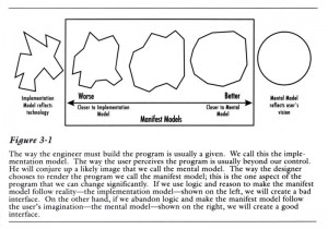
I have also discussed the idea that usable programs present a simple and coherent mental model that match the users’ expectations. Poorly-usable programs often have an interface based on an implementation model that reflects the underlying code. Instead of an interface that reflects the underlying modules of code, coders need to overlay their module structure (and likely spaghetti-like code) with the illusion of a simple, easy-to-understand machine. This is not a trivial task.
Here is an example, from a medical charting program I use. It illustrates both of these points.
I was using DocuTAP, a system for urgent care charting. I had been using it parttime for almost a year, so was fairly familiar with it. When first trained on it (an hour or so of overview), I was told that you could draw diagrams, but it looked so klunky I never tried it. But yesterday, I saw a patient with a very broad (though superficial) corneal abrasion, and thought I would try to diagram it on the chart.
Of course I had no clue about how to do this; I’m not even sure I would have remembered a week after that one-hour training. So I started inspecting the main DocuTAP screen. It’s pretty crowded.
Aha! I saw the word “Images” near the top. I see “Images” and I think Google Image Search, Picasa, or maybe sketch diagrams of an eye on which I can draw.
I clicked on “Images.” Wrong, wrong, wrong. It wasn’t the diagram-charting module, it was something else. OK, what else can I click on that looks as though it would let me draw a diagram of a corneal abrasion?
I spent maybe five minutes looking and finally gave up. I asked one of the PAs. She immediately pointed to an icon of a pushpin. I said “That’s how I chart a diagram? What has a pushpin got to do with drawing a diagram?” I finally figured out that it maybe means that you draw a diagram and then use a pushpin to attach it to the chart. Well, if this is by analogy to what we used to do with paper charts, I guess it should be a staple or a paper clip, but still, I’m not sure if I would figure that out without help. Maybe it’s just me being stupid. But I think many others would be just as “stupid.”
Sometimes people (usually quite-intelligent people) say they are having problems with a computer program because they simply aren’t “computer literate.” I tell them it’s because the coder didn’t make the program “human-literate.”
But let me go back to the main point: that word I clicked on before: “Images.” It showed me images of scanned documents that had been attached to the chart. I’d been wondering for months how to find those! I actually had thought that “Images” was to take a picture with a digital camera and upload it to the chart. (Not a bad idea, that.)
To a coder, scanned documents are images. The might be bloated TIFF files, they might be PNG files, but most likely they’re JPG files embedded in an Adobe Acrobat PDF file. But they’re images.
But to someone working on a medical chart, they’re not “images.” To medical charting users, scanned documents are just that, documents. When I’m thinking about medical charting as a coder, those scanned documents are images. But when I’m thinking about medical charting as a user, I don’t think of them as images, I think of them as “Scans” or maybe “Scanned Documents” or maybe “Attachments.” (Though that last is getting a bit coder-ish.)
I think DocuTAP could make their program a lot more user-friendly by just changing that one word “Images.” It would be interesting to do some discount usability testing and figure out how many people can find the attached scanned document images when the link is “Images” and how many can find it when the link is “Scanned Documents.”
(Let me say that I’m picking on DocuTAP only as an example because I have used it regularly. While it could do with a usability makeover, it’s actually better than many of its competitors.)
Bruce Tognazinni was right. Changing one word can make a world of difference.
I know you’ve been waiting for it. OK. Here’s the quote with the right word:
What’s in a name? That which we call a rose
By any other name would smell as sweet.
Tags: Computers, Healthcare, Healthcare IT, Human Error, icons, Information Design, Information Technology, IT, Learnability, Tognazinni's Paradox, Tutorial, Usability, User Interaction Design, User Interface


