If the point of contact between the product and the people becomes a point of friction, then the Industrial Designer has failed.
–Henry Dreyfuss, Designing for People, 1955
Mental Models
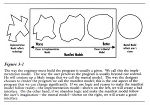
In the first edition of About Face, one of the first design/usability texts (and a great read, much more personal, personable and readable than subsequent, more formal, editions) , Cooper speaks of the difference between the programmer’s mental model of the program (“implementation model”) and the user’s mental model.
Programmers (coders) deep in the intricacies of the program’s code understandably find it very hard to put themselves in our shoes. As a result, much software – medical and otherwise – reflects the underlying structure of the program rather than the processes the program is supposed to automate. One common process in the ED is a good example of an implementation model and we will consider it here.
A common tracking-system task is to indicate that something needs to be done. In line with Cooper’s persona method, discussed in Computers in the ED 5), we will assume this is a first-year emergency medicine resident named Jack who is new to this tracking system. Let us start by asking how a naïve user like Jack might expect to perform the task of “add a green dot to the patient care box of Ima Klutz.” (For this tracking system, this will indicate it’s OK for the nurse to discharge Mr. Klutz, whose laceration Jack has repaired.) We will learn about Jack’s use of a generic tracking board, one I’ve created, modeled on several middle-of-the-pack tracking systems available in 2009, through Jakob Nielsen’s “discount usability testing.”
Jack first looks at the screen (“Generic Tracking Board Example”) to see if there is a green dot to drag onto the Patient Care box. He sees no green dots anywhere on the screen. Next, Jack scans the screen, finds the “Patient Care” box for Mr. Klutz, and uses the mouse to right-click it. Jack expects to see a context menu (a standard right-click menu) with a green dot option on it, or a short list of options to add to the Patient Care box. Instead, Jack sees a large, almost screen-filling dialog box (the figure “Generic Tracking Popup”). I know of one tracking system where this large box is only about 1/5 of the screen with which one is presented, with the rest of the screen filled with options that are seldom if ever used by the average user; I will freely admit that, in order to have a good bad example, I have copied many of the behaviors of this “generic tracking system” from that particular tracking system.
But there is no green dot here, not even as a pedagogic vector (i.e., a reminder of what the icons mean). Jack has to scan nearly the entire screen (including that other 4/5 of the screen that appears in the system I mentioned above) to find the word “Discharge.” As compared to preattentive recognition, which is picked up easily by peripheral vision and quickly recognized (see Computers in the ED 8) Jack has to run his eyes over the screen, reading all the text on the screen to find the right option. This is a classic example of cognitive friction – things that slow users down and make them more likely to make an error.
We know that central (foveal) vision subtends an angle of only six degrees – for the author’s monitor at his usual viewing distance of 27”, this means that he can only read in a 2.5” circle on the screen. As surprising as it seems, our vision is a veritable blur outside the 6 degree foveal circle. Of interest, though peripheral vision is color-blind, it can pick up many preattentive attributes, and is very good at picking up motion, so movement is better than color or shape to indicate an urgent on-screen message. (Which also is why flashing website ads are so irritating.) To find text information outside this circle, Jack must scan the screen – slowing him down and inviting error – using that 2.5” diameter foveal-vision “spotlight” to read all the text – as there are no preattentive clues as to where “Discharge” might be. Adding the icons next to the corresponding item would make this much easier for users.
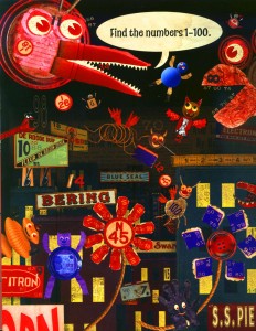
Jack finally finds the word “DISCHARGE.” After some hesitation – he’s not sure if that gray square next to it is a checkbox or not, and is distracted for a while by the tabs at the top that say “Now” and “Change” – he finally decides to ignore them. He is also distracted for a bit longer by the three additional boxes on the dialog box (not shown in my example); one at the bottom that says “Time – Event – Status – User,” another at the top right that says “All Event Types” and yet another at the bottom right that says “Order – Status.” He mentions that it’s really hard to figure out what needs to be ignored on this screen. The look of concentrated effort on his face seems remarkably similar to that on the author’s 9-year old daughter when she was first confronted with the figure “Find the numbers 1-100”.
Jack notes that he’s now learned where the “Discharge” box is so that the next time he needs to discharge a patient he can find it. However, it turns out that the next time he tries to discharge a patient, the word “Discharge” might be in a different place – it turns out that, once Jack has clicked the gray box next to “Discharge” the word “Discharge” disappears from this list. Similarly, other words disappear from the list, and those few words that Jack needs to use over and over again – mostly “Discharge” and “Ready to Admit” – move around as other words, used by nurses or secretaries, disappear from the list.
And we know, from the PEN-Ivory experiments, that positional memory is essential for efficient use of computer systems. If “Discharge” and “Ready to Admit” stayed in the same place, then with a little practice, even if Jack doesn’t consciously remember where they are, Jack’s fingers on the mouse will quickly and subconsciously guide his mouse to the right place. But since the words move around, Jack will have to scan the text on the screen each time, slowing him down and making error more likely (more cognitive friction).
An even more difficult task is to take the green dot off – in the tracking system I’m using as a bad example, it requires such a complex procedure that I’m not going to include it here as it would serve no purpose except to (a) convince you, the reader, that there are ways to make this process better, and (b) probably lose you halfway through.
Could this Generic Tracking System be changed to make this better? Three epigrams from the first edition of Alan Cooper’s About Face 3: The Essentials of Interaction Design seem appropriate at this point:
- A rich visual interaction is the key to successful direct manipulation.
- A dialog box is another room. Have a good reason to go there.
- Build function controls into the window where they are used.
Let us, hypothetically, apply these principles to decrease the cognitive friction of this process.
Look at the basic tracking screen. There is plenty of room to surround this basic tracking screen with other functions. What if we were to fill some of this unused space with a tray holding all of the icons? Jack could use his mouse to grab the green dot for “Discharge” – or the blue star for “Ready to Admit” – and drag it to the patient’s “Patient Care” box. And when we told him to take off that green dot, he could just drag it to a little trash can icon next to the other icon tray. No additional dialog box. No “find the numbers 1-100” cognitive friction. The tray of icons could have “tooltips” – so that when Jack moves his mouse over an icon, a tiny popup will appear, for example with “discharge” or “ready to admit.” Like the icons next to menu items discussed below, this is a pedagogic vector, teaching Jack what each of the icons means.
The “apply icon” dialog box I showed is a classic implementation model – very close to the underlying program code, but not at all close to any mental model Jack’s been able to come up with. In terms of Cooper’s figure above, the existing process has lots of jagged edges, in need of usability “sanding.” Or better, a redesign specifically based on a mental model that Jack and others can easily discover/create when they first encounter the program. The fact that we tend to create such mental models, how and why we do, and the implications thereof are explored further in the works of Donald A. Norman, all of which I can recommend without reservation.





The difficulty in designing a program that matches Jack’s mental model – and Joseph’s and Gretchen’s and Tara’s – is what that led Alan Cooper to develop the persona method. To ensure that coders make the program conform to user mental models, the design team develops a few personas representing frequent users of the system. For example, a young, computer-literate emergency medicine intern (Jack), an older and non-computer-literate physician visiting the ED (Joseph), an ED nurse (Gretchen), and an ED unit secretary (Tara). The design team can now speak of how a feature would be used, by Jack, by Joseph, by Gretchen or by Tara. This method is described further in the Personas essay.
This is very powerful. As with users forming mental models of a program, the coders who create the program need to form effective mental models of the users.
If the Generic Tracking System design team had used personas, they would likely have come up with something like a tray of draggable icons, or at least something somewhat easier for Jack to use.
Bottom line: a simple task requires concentrated attention, then we talk about a high level of cognitive friction. High-friction processes like this need usability-sanding, through discount usability testing, and to use preattentive processing to decrease their cognitive friction.
Switching Modes
A common task in any computerized ED (and for discharging many admitted patients) is to select and print discharge instructions for a patient.
To search for a discharge instruction, search for a follow-up doctor or clinic, or search for medication to enter on a prescription, typically we must:
- move our eyes and our mouse cursor to a search box
- start typing what we want to find
- move our eyes from the search box to the results listbox below to make sure we’ve found the right thing
- take our eyes off the screen and look around for the mouse
- take our hands off the keyboard and move them to the mouse
- return our eyes to the keyboard and find the listbox again
- move the mouse cursor to the listbox, click on the instruction, doctor or medication
This process has a very high cognitive and psychomotor friction. It takes us a while to get through, it requires fairly fine hand-eye coordination, it invites error and it demands more attention than it really deserves. (And, in a busy and chaotic ED, our attention is a scarce resource that, to prevent medical error, program designers must religiously conserve.)
Typing is an input mode. Using the mouse is an input mode. Using a touchscreen is an input mode. Each mode is a bit different – it’s hard to draw pictures with the keyboard, but not that hard with a mouse; it’s hard to enter text with a mouse, or even a touchscreen, but a keyboard allows people to enter text at speeds up to or past 100 words per minute.
We must be conscious also of mode transitions. Every time we have to switch from mouse to keyboard, or from keyboard to touchscreen, we have to slow down and switch on and off different parts of our mind. And, we are distracted from the task at hand by the mode-switch, so mode switches are an invitation to error. Medical application programs should be carefully surveyed, by watching actual users at work, to detect when we feel compelled to switch modes, and those cognitive “rough spots” should be smoothed over. For example, once we are typing on a keyboard, we should be allowed – and, given how many people have at least basic touch-typing skills these days, even encouraged – to continue using the keyboard. We should see visual affordance (visual hints) that we can continue to use the keyboard – for example fields prominently highlighted when they are active for typing, and non-intrusive suggestions to use the tab or arrow key between fields, such as a small arrow just outside the bottom border of the currently-active text box.
We should be able to accomplish common tasks without changing input modes. We should be able to move through our tasks using fingers on a touchscreen, typing on a keyboard, or using the mouse, without ever being forced (even if just by ignorance of the tab key to switch fields) to switch modes. Discount usability testing can identify points where the system should be changed to keep us from feeling the need to switch modes.
If you are evaluating a computer program for use in your hospital or ED, you may pick a couple of common tasks (e.g., discharging a patient from the ED), and have someone sitting beside you keep track of the number of times you switch input modes, and how often you have to pause to think about what you’re doing due to the high cognitive friction of the interface. After you’re done, retrospect and see if, during your attempt to use the program, if you’ve now been able to create a usable and coherent mental model of how the program works. Compare with your experiences, with, say, searching with Google or buying something on amazon.com. This should help you form some idea of how easy or hard this system will be for your users.
The concept of cognitive friction is key for usability and medical-computing error prevention. This post gave a few examples of how to detect cognitive friction – but any time you find yourself getting angry at a computer system, stop and analyze why you are feeling this cognitive friction – if you can recognize and document it, maybe it can be fixed. And sometimes, those fixes are not that hard to make. Get your sandpaper ready!
Tags: Alan Cooper, Cognitive Friction, Computers, Discount Usability Testing, Donald A. Norman, ED, ED Systems, Emergency Department, Foveal Vision, Healthcare IT, Implementation Model, Information Technology, Input Modes, IT, Mental Model, Peripheral Vision, Preattentive Processing, Tracking System, Tutorial, Usability, User Interaction Design, User Interface
