One feature of most tracking systems is data display for an individual patient in the Emergency Department.
In most tracking systems, we can double-click on the patient’s name, and then we see a pop-up window, populated with things that the nurses have entered and that are found in the patient’s electronic medical record (EMR) entry: ED triage note, medications, allergies, past medical history, and the like.
This is the electronic equivalent of looking at printed nurses’ notes. As with any electronic medical record, it has the advantage of being visible from any computer. However, for many EMR implementations, we can’t see these notes until the ED triage nurse completes the note and closes it. Allowing individual bits of the nurse’s note to populate the ED patient view early would allow physicians to see the notes early, rather than often going to see the patient without the benefit of reviewing the nurse’s already-entered information.
Unlike other parts of tracking systems, which involve complex user interaction, an ED Patient View may be simple display of data, providing a straightforward exercise in information design.
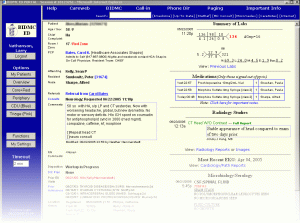
There are of course ED Patient Views that draw in radiology and other reports, and shows clickable links to old labs and other information. An homebrew example from Dr. Larry Nathanson of Boston’s Beth Israel ED is shown.
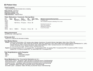
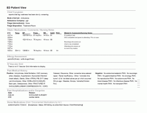
However, we will approach this in an incremental, usability-sanding manner, rather than a top-down design approach, considering it as a display-only document. This will illustrate the application of basic information design principles. We will start with a draft example, shown as ED Patient View (first draft)
First we will start with typography. For reading a paragraph of text, serif text is generally preferred. For example, this blog’s text will show on most browsers in the typeface Georgia, which has serifs – little flourishes – at the tops of the end of the strokes of many of the letters. However, for text that is to be read in small chunks, a sans-serif font, such as the Verdana typeface used in some of the headers of this post, is preferred. The Arial used in the first draft is highly readable, and although I prefer Gill Sans or Verdana, this is a reasonable choice of typeface.
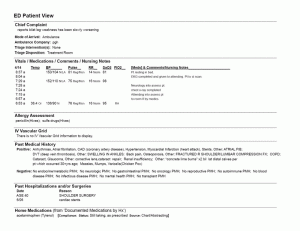
We know that readers read more slowly and comprehend more when lines of type have more white space “leading” between them. Most of the text in the ED Patient View is 9-point text with 10.8 point leading – but reading where accuracy is important, more leading is recommended. And, for longer lines (and the ED Patient View lines can be very long), more leading is recommended. For example, this is 9.5 point text on 14-point leading with a 3-inch column width. An example of the ED Patient View with more appropriate spacing appears in ED Patient View – Spaced.
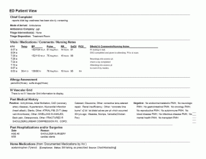
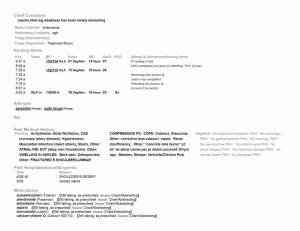
Still, the line length in the PMH makes it difficult to read – it’s recommended that lines be only about 36 characters long for readability – so ED Patient View – Columned shows the PMH formatted into three columns.
Next, emphasis: important information (data pixels) should be emphasized. Non-essential information and headings (non-data pixels) should be deemphasized. ED Patient View – Tinted shows the headings still left big to make it easy to find the sections, but tinted gray to decrease contrast with the white background. Thus our eyes will be more drawn to the data text rather than the heading text. We can also emphasize important information – chief complaint, vital signs, medication names, and the like – by making them bold. We can de-emphasize boilerplate information such as the negatives in the PMH by making them gray. Highlighting important information such as out-of-bounds vital signs with color might be helpful, but this seems to be a black-and-white text display, so we will use underlining, but only for out-of-bounds values and allergies.
Next, parsimony: “omit needless words” and “omit needless pixels.” We can elminate the text inside the box that says “ED Patient View.” It’s obvious from context and inspection what this is, no need for a label at the top.
We may change the header “Vitals / Medications / Comments / Nursing Notes” to just “Nursing Notes” (it’s easy to see by simple inspection that this includes vital signs as well). “Allergy Assessment” can become “Allergies,” “IV Vascular Grid” can become “IVs,” “Home Medications (from ‘Documented Medications by Hx’)” can become “Medications” and so forth.
We can replace entries like “none” and “There is no IV Vascular Grid information to display” with blank space. Under “Medications” we can eliminate the headings like “Compliance: Status:” as these are implied by the content after them; and though the source of medications is useful, it’s probably not needed in this overview.
Graphic design guidelines recommend the use of white space instead of lines wherever possible, to avoid distracting clutter, so we can also replace the lines with 6-point vertical spaces. (See ED Patient View – Parsimony.)
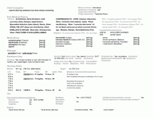
Next: neatness and organization. The Chief Complaint deserves pride of place at the top left, but the arrival information under this is not nearly as important, so we can move this to the right of the Chief Complaint. We can also put some tabs into the Medications list to neaten it up a bit.
But most importantly, we can follow the standard – which is to organize this information the same way we organize a history and physical exam. Certainly, it is good to keep important information “above the fold” so the we don’t have to scroll to find it, but keeping it well-organized is important as well. We can also format some of the information in multiple columns to make it more compact. See the final results in ED Patient View – Neatness.
Again, this is merely the result of usability-sanding. A ground up redesign using modern design principles, the persona method and discount usability testing would result in a far better product (refer back to Larry Nathanson’s Beth Israel ED Patient View for a clever design), but comparing the first draft with the final draft, perhaps you can see some improvement in readability. You will note that, despite the increased text spacing, the reorganization allows more information “above the fold.”
There is much more to learn about typography, readability, graphic design and information design. But this post, I hope, captures the bare essentials and gives a simple set of procedures for usability-sanding of basic data displays.
If you look through the previous entries in this series, you’ll find a number of recommendations for readings if you wish to pursue these ideas further.
Tags: Computers, ED, ED Systems, Emergency Department, Healthcare, Healthcare IT, Information Design, Information Technology, IT, Parsimony, Tracking System, Tutorial, Typography, Usability, User Interaction Design, User Interface
