God is in the details
–Mies van der Rohe
The primary function of an ED tracking system – at least if you look at it from the right direction – is to display relevant, timely data to the user. A tracking system may do other things, but this function of data display is arguably its most important function. If a tracking system displays the wrong data, or outdated data, or is so poorly designed that users miss important data, then it’s not doing a good job.
So, we should focus on the way tracking systems display data, which falls squarely in the domain of information design. I’ve already discussed many of aspects of information design in the Medical Computing series, particularly to the first essay on Information Design, to which I will refer incessantly in this post. You may think of this as an executive summary of that series to date, with a few extensions and elaborations unique to tracking systems.
A good tracking system will meet all of the following criteria. A great tracking system will do so with panache and style. As far as I can tell, the best of today’s “niche” ED tracking systems (systems designed specifically for the ED) are not quite up to this standard, and the offerings of the big HIS (hospital information systems) vendors fall far below.
Users such as Donna, Bill, Jill, and Joyce must be able to, when they come up to the tracking system for the first time, be able to quickly and correctly learn how to use it: learnability. And, when they come back to it for the second, third and subsequent times, they must have retained what they learned that first day: memorability. And, it should be easy for them to accomplish their daily tasks using the tracking system: usability. These concepts are discussed in more detail in Usability, Learnability, Memorability. A tracking system that is usable, memorable, and learnable will be praised by its users, even if it only provides a few essential tracking functions.
The tracking screens are designed with integrity: the screens are lean and spare, and free of any superfluous logos or ornamentation. Screens are simple: not too much crowded onto each one, and like needless words, visual items that are not essential to the tasks at hand have been omitted or hidden: abstraction. These concepts are elaborated, with examples, in Design Integrity, Simplicity and Abstraction. The contents of each screen are carefully crafted to represent the common tasks of Donna, Bill, Jill and Joyce, or other appropriate personas. Items that Donna, Bill, Jill and Joyce use infrequently are hidden away from the main screens, to provide a clean, spare design.
Given Tognazinni’s Paradox, any text on the screen was checked to assure that naïve users can understand it. And, having used inexpensive and easy Discount Usability Testing, the vendor proudly tells prospective customers how the design has been “sanded” to reduce cognitive friction, as discussed in Mental Models, Input Modes and Cognitive Friction, and that the overall design has been carefully crafted to not only make the daily tasks of Donna, Bill, Jill and Joyce easy and error-free, but to meet their goals as well, as detailed in Goals vs. Tasks.
Where screens contain narrative text (like the nurses’ triage note), it was carefully analyzed for proper typeface, line length and “leading” (spacing between lines) in concert with modern principles of typography expressed by Bringhurst. The overall design of each screen, including careful use of white space, was carefully tweaked in concert with well-established principles of computer graphic design expressed by Sun Microsystems. Color schemes were carefully chosen according to the art and science of color expressed by Itten. The overall presentation of data, such as deemphasizing non-data pixels, was designed in accordance with the published works of Yale’s Edward Tufte. Data entry forms (such as for putting in vital signs) were designed in accordance with modern forms design principles per the recommendations of Robert Barnett. Recognizing that a tracking system is a form of an information dashboard, data such as the status of labs and x-rays is presented using design elements that are preattentively processed as described in the books of Stephen Few and Colin Ware. These ideas are further explored in Information Design, Performance, Data Pixels, Location, and Preattentive Attributes and Icons, Pegagogic Vectors, Forms Design and Posture.
All icons were designed to be preattentively recognized, and with color-blind men in mind. All common tasks may be accomplished by direct manipulation of objects on the screen or pressing an icon, but there is also a menu at the top that serves as a pedagogic vector; each menu item has a small version of the corresponding direct-manipulation icon or object next to it. The tracking system assumes a coke-machine or kiosk posture: computers in the ED which have been left unattended for more than 10 minutes show the default ED tracking screen as a type of screen-blanker. In public areas of the ED such as hallways or patient rooms, sensitive information is blanked out. The default screen, given minor adaptions for the constraints of screen size, looks the same on all PCs and can be modified only if one logs into one’s personal computer account, and only for that login. These ideas are pursued further in Icons, Pegagogic Vectors, Forms Design and Posture.
The structure of the screens and menus has been carefully tweaked to create an easy-to-remember user mental model of how the system works, a model close to the normal work activities in the ED. This mental model has little to do with how the underlying computer code really works, but having a simple mental model of how the tracking system works allows Donna, Bill, Jill and Joyce to use the system in a much more intuitive manner. They can also use the system with different input modes. Jill and Joyce are most happy using the mouse, as they grew up using a computer mouse. Donna and Bill are older, and less enamored of the mouse, and both touch-type 90+ words a minute, and they are pleased that they can accomplish all their daily tasks by typing, using the Enter key and a few alt-keys (e.g., Alt-N to create a new patient entry) to do everything they need to do with the system. These ideas are explored further in Mental Models, Input Modes and Cognitive Friction.
As described in Search, finding patient information for those who have left the tracking board is easy. The tracking system’s search box uses a frecency (frequency + recency) algorithm, so typing in an approximation of the patient’s name will provide a list of similar-sounding names, with those most recently discharged or admitted from the ED at the top. Searching for a diagnosis, such as trimalleolar fracture, lists those patients most recently in the ED with that diagnosis (helpful when the ortho calls and says “who was that patient with the trimalleolar fracture who was admitted a few hours ago?”) Double-clicking on a patient name brings up, as discussed in Data Display, a patient dashboard page, densely filled with relevant clinical date and links to more detailed information such as X-ray and CT images, and more detailed lab reports. This single page and its links provides everything that Donna, Bill, Jill and Joyce need to answer questions about the patient, give report/signout, or determine what to do with the patient next.
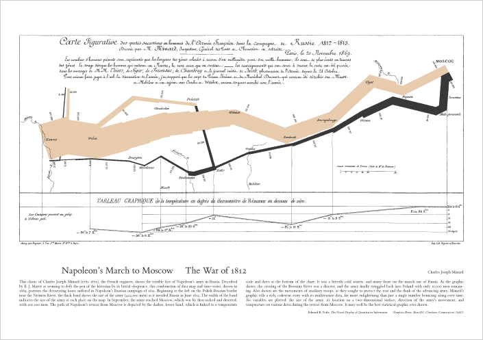
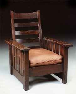
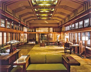
As with a Minard data graphic of Napoleon’s ill-fated march to Moscow in 1812, the Stickley Craftsman-style Morris Chair in the Great Room of my house, or a room designed by Frank Lloyd Wright and now ensconced in the American Wing of the Metropolitan Museum of Art, this ideal tracking system is a work of art and craftsmanship, with its beauty arising from its tight construction and elegant design, not from applied ornamentation.
I eagerly await its construction.
Discount Usability Testing
Tags: Computers, Dashboard, Discount Usability Testing, ED, ED Systems, Emergency Department, Form Design, Healthcare IT, icons, Information Dashboard Design, Information Technology, IT, Learnability, Memorability, Preattentive, Tracking System, Tutorial, User Interaction Design, User Interface


