Anticryptography

This entry is part 8 of 44 in the series Words

We all know what cryptography is:

cryp·tog·ra·phy, n.
1.    the science or study of the techniques of secret writing, esp. code and cipher systems, methods, and the like. Cf. cryptanalysis (def. 2).
2.    the procedures, processes, methods, etc., of making and using secret writing, as codes or ciphers.
3.    anything written in a secret code, cipher, or the like.
[1635–45; CRYPTO- + -GRAPHY]

But do you know what anticryptography is?

In its most glamorous guise, it is the art and science of designing easy-to-understand messages to send into space for alien civilizations to read. More mundanely, it is the art and science of designing messages, usually visual, that may be easily interpreted by those of widely-varying language and culture.

Graphic designers have been practicing anticryptography for a long time, designing easy-to-understand signs. The idea of standard signs, with similar shapes and forms, appears multiple times – most recently and obviously in the icons developed for the Olympics, and in the set of 50 standard transportation-oriented signs developed by AIGA.

Read the rest of this entry »

Share

Data Display

This entry is part 12 of 12 in the series Medical Computing

One feature of most tracking systems is data display for an individual patient in the Emergency Department.

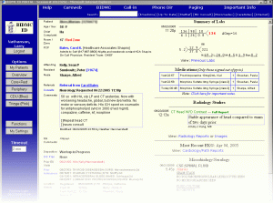
Beth Israel ED Patient View

Beth Israel ED Patient View

In most tracking systems, we can double-click on the patient’s name, and then we see a pop-up window, populated with things that the nurses have entered and that are found in the patient’s electronic medical record (EMR) entry: ED triage note, medications, allergies, past medical history, and the like.

This is the electronic equivalent of looking at printed nurses’ notes. As with any electronic medical record, it has the advantage of being visible from any computer. However, for many EMR implementations, we can’t see these notes until the ED triage nurse completes the note and closes it. Allowing individual bits of the nurse’s note to populate the ED patient view early would allow physicians to see the notes early, rather than often going to see the patient without the benefit of reviewing the nurse’s already-entered information.

Unlike other parts of tracking systems, which involve complex user interaction, an ED Patient View may be simple display of data, providing a straightforward exercise in information design. Read the rest of this entry »

Share

Search

This entry is part 11 of 12 in the series Medical Computing

To find something using the Google search engine, or a location using Google Maps, we simply type in a few words and then browse the results. This is so much better than what was available before that it has made Google one of the richest corporations in the history of the world.

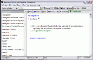
Autocomplete, Stedman's Medical Dictionary

Autocomplete, Stedman’s Medical Dictionary

However, many programs’ search functions still require you to enter the first name in this box, the last name in that box, and the gender in this other box. Faugh.

Users of Cerner, including their ED tracking system, Firstnet, are lucky as regards search (though perhaps not so lucky in other respects). There is indeed a set of boxes where we can type in a variety of identifiers (name, FIN NBR, MRN, CMRN, SSN, Birthdate, and/or Gender). But, we can simply type, in the “name” search box, either “Lastname, Firstname” or “Firstname Lastname.” Then, we are presented with a list of matches, with information such as SSN and birthdate, that we can use to identify the correct patient. Simple. Elegant. Fast.

Google Autocomplete

Google Autocomplete

The Google method – entering just enough information to get a good set of possible matches, then presenting them for review – has now been voted (by user’s choice of search engines) as the standard for searching. As Donald A. Norman says, if we want usable designs, we have to accept standards, even if we don’t like them, and since user expectations are molded by Google, we might as well resign ourselves to it.

There are other ways to make searching easier, and they are starting to become standards as well. Autocomplete is when the program predicts a word or phrase that the user wants to type in, without the user actually typing it in completely. This is effective when there are a limited number of possible or commonly used words, as is the case with most medical software. Autocomplete can speed up user interactions significantly, especially for those who type slowly.

Firefox Search Box

Firefox Search Box

Autocomplete has been available for many years in some programs – for instance, the financial program Quicken, or Stedman’s Medical Dictionary. In these implementations, the autocomplete appears after the cursor as one types, often in grey, or may fill in multiple fields, as in Quicken. However, autocomplete is more familiar from the ubiquitous search engine Google, and the web browsers Internet Explorer and Firefox. Read the rest of this entry »

Share

Mental Models, Input Modes and Cognitive Friction

This entry is part 10 of 12 in the series Medical Computing

If the point of contact between the product and the people becomes a point of friction, then the Industrial Designer has failed.
–Henry Dreyfuss, Designing for People, 1955

Mental Models

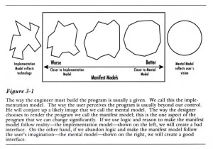
In the first edition of About Face, one of the first design/usability texts (and a great read, much more personal, personable and readable than subsequent, more formal, editions) , Cooper speaks of the difference between the programmer’s mental model of the program (“implementation model”) and the user’s mental model.

User Mental Models vs. Implementation Models

User Mental Models vs. Implementation Models

Generic Tracking Board Example

Generic Tracking Board Example

Programmers (coders) deep in the intricacies of the program’s code understandably find it very hard to put themselves in our shoes. As a result, much software – medical and otherwise – reflects the underlying structure of the program rather than the processes the program is supposed to automate. One common process in the ED  is a good example of an implementation model and we will consider it here.

A common tracking-system task is to indicate that something needs to be done. In line with Cooper’s persona method, discussed in Computers in the ED 5), we will assume this is a first-year emergency medicine resident named Jack who is new to this tracking system. Let us start by asking how a naïve user like Jack might expect to perform the task of “add a green dot to the patient care box of Ima Klutz.” (For this tracking system, this will indicate it’s OK for the nurse to discharge Mr. Klutz, whose laceration Jack has repaired.) We will learn about Jack’s use of a generic tracking board, one I’ve created, modeled on several middle-of-the-pack tracking systems available in 2009, through Jakob Nielsen’s “discount usability testing.” Read the rest of this entry »

Share

Icons, Pedagogic Vectors, Forms Design and Posture

This entry is part 9 of 12 in the series Medical Computing

Icons and Pedagogic Vectors

We all have trouble remembering a program’s graphical icons. The International Standards Organisation (ISO) has a standard for icons – an icon must be interpreted correctly by 2/3 of  test subjects. In usability and error-prevention terms, a 1/3 error rate is poor, but reality is even worse – an experimental study of typical icons showed that 6 of 12 icons could be remembered by knowledgeable users, and new users could guess the meaning of only 1 of 12 icons. (Lindgaard, G., Chessari, J., & Ihsen, E. (1987). Icons in telecommunications: what makes pictorial information comprehensible to the user? Australian Telecommuncation Research, 21(2), 17-29, not available online.)

Pedagogic Vector, Microsoft Word

Pedagogic Vector, Microsoft Word

A vector, in user interaction terminology, is a way to interact with the computer. Common vectors include typing on the keyboard, using the mouse to directly manipulate objects on the screen, using the mouse to click on icons, or using the mouse to navigate a hierarchical menu system.

Some programs offer icons as shortcuts that may be used once learned, but all functions are available via a menu system. Microsoft Office applications such as Word and Excel are good examples. Every time we use the menu to pick “File” and then “Print” we see, next to the “Print” menu item, a picture of the little printer icon for this function. So, each time we use the menu system, we are taught what the icon looks like. This “pedagogic vector” helps us learn the icons. Clicking on icons is faster than a menu system, once you’ve learned the icons, but it’s easier to find a function on the menu system if you’re not familiar with the icons. Read the rest of this entry »

Share
//commented out L sidebar 7/26/11 //