Goals vs. Tasks

This entry is part 6 of 12 in the series Medical Computing

In past articles, we discussed human-illiterate computers, usability, memorability, learnability, Tognazzini’s Paradox, design integrity, simplicity, abstraction, discount usability testing, and personas. Now, we will discuss goals and tasks. These are similar terms, and sometimes used almost interchangeably. But using the terms task and goal sloppily is, according to expert software designers, an error that leads to disastrous software design. So it behooves us to understand the differences between tasks and goals in solid detail.

This is written as if I’m writing to someone who’s developing software; and though it is certainly my intent to get people writing software for Emergency Departments to pay attention, it’s just as much to for those of use who use ED software – or someone who is doing something homebrew using Excel or Microsoft Word macros.

The difference between tasks and goals relates to our previous discussion of personas in the last article. First, let’s look at some excerpts from a nice online overview of UML, the Uniform Modeling Language. UML, which is a couple of decades old, was a breakthrough in its day. It allows you to specify how a computer program should interact with people, not in ambiguous English, but using a grammar that allows a more precise specification. Key ideas incorporated in UML include actors: Read the rest of this entry
»

Share

Information Design

This entry is part 7 of 12 in the series Medical Computing

Wikipedia says: Information Design is the art and science of preparing information so that it can be used by human beings with efficiency and effectiveness. It goes on: the term has come to be used specifically for graphic design that has the purpose of displaying information effectively, rather than just attractively, or for the purpose of self expression by the designer as artist.

Action-Oriented Information Design drives actions, such as care of a stroke or MI. It aims to decrease error, to remind us to do those things that we know to do but might forget, and to improve our compliance with established guidelines, while not forcing us into rigid protocols. Action-oriented information design also encapsulates domain expertise to teach us better ways to perform our tasks. Those who write standing orders for a hospital, know it or not, are practicing action-oriented information design.

Information design evolved long before computers or the Internet, focusing on the printed page and graphic design. The following topics constitute a basic study guide for information design practitioners or critics:

Share

Performance, Data Pixels, Location, and Preattentive Attributes

This entry is part 8 of 12 in the series Medical Computing
Dueling Whiteboards courtesy Dr. R.L. Wears

Dueling Whiteboards courtesy Dr. R.L. Wears

A good principle for medical software is to design for the ED as a worst-case scenario. If it works there, it will work anywhere.No clinicians are as time-pressured as those in a busy Emergency Department. There, distractions – even seemingly minor ones like presenting a complete CBC instead of an abstract – slow the clinician down, and may distract from something more important.

Quoting from a recent presentation at  HIMSS:

Emergency physicians are majorly stressed and working at max capacity already. Darwinian selection means that ED staff (this is from the Critical Incident Stress Management literature):

  • have obsessive/compulsive personality traits
  • they like to be in control
  • they are risk oriented
  • they are action-oriented
  • they “need to be needed” and
  • they are dedicated

Emergency physicians are interrupted far more frequently than other physicians, and the same is true of ED nurses, techs, and certainly clinical secretaries. So, those in the ED are intolerant of anything that wastes their time. (Look at the “Dueling whiteboards” picture at the beginning of this post; note the number of users of the handwritten whiteboard vs. the computer-based one.) This is why the IT department (Information Technology = “the computer nerds”) traditionally hates the ED, and why IT projects fail in the ED more than in other units. Nonetheless, making things work in the ED is a path to success throughout the hospital. Read the rest of this entry
»

Share

Icons, Pedagogic Vectors, Forms Design and Posture

This entry is part 9 of 12 in the series Medical Computing

Icons and Pedagogic Vectors

We all have trouble remembering a program’s graphical icons. The International Standards Organisation (ISO) has a standard for icons – an icon must be interpreted correctly by 2/3 of  test subjects. In usability and error-prevention terms, a 1/3 error rate is poor, but reality is even worse – an experimental study of typical icons showed that 6 of 12 icons could be remembered by knowledgeable users, and new users could guess the meaning of only 1 of 12 icons. (Lindgaard, G., Chessari, J., & Ihsen, E. (1987). Icons in telecommunications: what makes pictorial information comprehensible to the user? Australian Telecommuncation Research, 21(2), 17-29, not available online.)

Pedagogic Vector, Microsoft Word

Pedagogic Vector, Microsoft Word

A vector, in user interaction terminology, is a way to interact with the computer. Common vectors include typing on the keyboard, using the mouse to directly manipulate objects on the screen, using the mouse to click on icons, or using the mouse to navigate a hierarchical menu system.

Some programs offer icons as shortcuts that may be used once learned, but all functions are available via a menu system. Microsoft Office applications such as Word and Excel are good examples. Every time we use the menu to pick “File” and then “Print” we see, next to the “Print” menu item, a picture of the little printer icon for this function. So, each time we use the menu system, we are taught what the icon looks like. This “pedagogic vector” helps us learn the icons. Clicking on icons is faster than a menu system, once you’ve learned the icons, but it’s easier to find a function on the menu system if you’re not familiar with the icons. Read the rest of this entry
»

Share

Mental Models, Input Modes and Cognitive Friction

This entry is part 10 of 12 in the series Medical Computing

If the point of contact between the product and the people becomes a point of friction, then the Industrial Designer has failed.
–Henry Dreyfuss, Designing for People, 1955

Mental Models

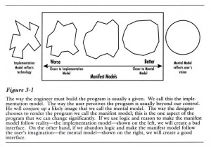
In the first edition of About Face, one of the first design/usability texts (and a great read, much more personal, personable and readable than subsequent, more formal, editions) , Cooper speaks of the difference between the programmer’s mental model of the program (“implementation model”) and the user’s mental model.

User Mental Models vs. Implementation Models

User Mental Models vs. Implementation Models

Generic Tracking Board Example

Generic Tracking Board Example

Programmers (coders) deep in the intricacies of the program’s code understandably find it very hard to put themselves in our shoes. As a result, much software – medical and otherwise – reflects the underlying structure of the program rather than the processes the program is supposed to automate. One common process in the ED  is a good example of an implementation model and we will consider it here.

A common tracking-system task is to indicate that something needs to be done. In line with Cooper’s persona method, discussed in Computers in the ED 5), we will assume this is a first-year emergency medicine resident named Jack who is new to this tracking system. Let us start by asking how a naïve user like Jack might expect to perform the task of “add a green dot to the patient care box of Ima Klutz.” (For this tracking system, this will indicate it’s OK for the nurse to discharge Mr. Klutz, whose laceration Jack has repaired.) We will learn about Jack’s use of a generic tracking board, one I’ve created, modeled on several middle-of-the-pack tracking systems available in 2009, through Jakob Nielsen’s “discount usability testing.” Read the rest of this entry
»

Share