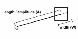
Fitts’s Law has been known since Paul Fitts first proposed it in 1954. Wikipedia has a detailed exposition of Fitts’s Law. In essence, it says that “the time required to rapidly move to a target area is a function of the distance to the target and the size of the target.” “Targets that are smaller and/or farther away require more time to acquire.” While this has many applications in industry, we are particularly interested in computer applications, and, specifically, usability of medical software.
We can expand this definition a bit, by being engineers and designers and critics rather than scientists. It is reasonable to assume that the harder something is to do, the more fatigue – mental, physical or both – it will entail.
We know from the Pen-Ivory experiments that paging is better than scrolling. Many vendors are tied to the idea of resizable windows, both due to laziness, and due to user demands to use the maximum space on their monitors. But as with lines of text, increasing the window size may decrease readability and usability.
Many medical applications present us with pages filled with a massive number of small targets. We know that a larger the number of choices on a screen means a more cognitively-tiring process in selecting among them. But there is another dimension to such cluttered pages; when clickable items are widely separated on the page, Fitts’s Law tells us that using the page could be made easier, in both physical and cognitive terms, by decreasing the number of clickable items on the page and increasing their clickable target size. As Strunk and White says: “omit needless clickable items.” (I paraphrase slightly.)
Fitts’s Law is interesting. But for medical applications, where a wrong click may have consequences far beyond navigating to the wrong page, it’s something all developers should keep in the front of their minds. Wrong clicks can kill.
Tags: Discount Usability Testing, Fitts's Law, Healthcare, Healthcare IT, Human Error, Information Technology, IT, Usability, User Interaction Design, User Interface

