- Brittleness
- Robustness
- Diversity
- “Niche” Computer Systems
- Downtime
- Meaningful Use
- Efficiency
- Anticryptography
- Color
- RHIO
- “Wrong Patient”
- Cognitive Friction
- Dialog-Box Rooms
- Ignore
- What’s in a word?
- ALLCAPS
- Layers
- Consistency
- Menu
- Cost Disease
- RAND
- PHR
- Model T
- Giveaway
- Skeuomorphism
- Icon
- Signal-to-Noise Ratio
- Anti-Data Pixels
- iPhones
- Suicide
- Anthropology
- Wireframes
- Fitts’s Law
- Kludge
- Ebola
- Pop-Up
- Clicks
- Bad Apple
- Testing
- Bold
- Point-and-Click
- Anti-User Pixels
- Flat
- Glucose
In Icons, Pedagogic Vectors, Forms Design and Posture we briefly discussed icon design. (Icons, in this context, meaning the sketch-pictures on buttons that you can click.) The bottom line was that it’s hard to learn and remember what icons stand for.
In Performance, Data Pixels, Location, and Preattentive Attributes we discussed how icons should be recognizable by preattentive attributes, so there is no Cognitive Friction to overcome when selecting the right icon on which to click.
In Color, we discussed the role of color in icons, coming down to the idea that icons shouldn’t use color, and should be grayscale.
In Anticryptography, we discussed pictograms as used for warning signs, signage for bathrooms (toilets or WCs if you’re from the British Isles) and the Olympics, giving good examples of such things.

Image credit: alvarocabrera / 123RF Stock Photo
Basically, we’ve learned a lot of things not to do, and how to criticize bad icon design. But in all my searching, I’ve been unable to find anything about how to design a good icon from the ground up. Except, maybe, the advice to “Read everything on this blog and everything written by Edward Tufte and Jakob Nielsen. And then go get a graduate degree in graphic design.”
But recently I’ve been reading a book by Christopher Alexander, an academic architect at the University of California at Berkeley, and the inventor of Pattern Language. It’s a series of three volumes, together titled The Nature of Order. His thesis – presented in an exceedingly accessible, scholarly and scientific way – is that we may reasonably expand the use of the word life from its traditional 20th century biological meaning. We often say of a great piece of art or architecture that “it’s full of life” and that’s what he’s getting at. (See page 189 of Book One: The Phenomenon of Life, of the four-book volume The Nature of Order: An Esay on the Art of Building and the Nature of the Universe.)
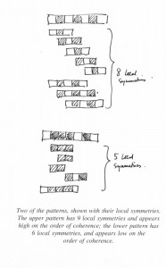
In trying to find out what brings life, he scientifically investigated some very simple examples, looking for what he called “coherence”. Each example was seven squares (pixels) in a row, on a gray background. There were 35 strips, each showing one of the possible arrangements of 3 black and 4 white squares. He asked many people to rate them for “coherence” (whatever that meant to the individual).
 He discovered, first, that to an extremely high degree, people all rate the strips in the same order.
He also tested alternate requests for his subjects, including rating the strips on being orderly, on being the most simple, or the most orderly. It didn’t matter, people sorted the strips in the same order.
And, he found that people’s rating corresponded to the number of symmetries in the strip… some of which were hidden (reversals of two white squares, for example).
The exciting part for me: he found that the strips with the largest coherence (largest number of symmetries) were also the easiest to remember.
Finally, here is a rigorous guide for how to create icons that are easy to remember, complete with both empirical and theoretical underpinnings.
In fact, you could probably just take the top 10 of his strips, and use them across the middle of a gray button, and come up with highly memorable and learnable icons.
Finally, let me add that reading this whole book will probably do you will at helping you create icons that are memorable, learnable and full of life – in Alexander’s sense of the word life.
Tags: Computers, Tutorial, Usability, User Interaction Design, User Interface, Information Design, Color, icons

