- Brittleness
- Robustness
- Diversity
- “Niche” Computer Systems
- Downtime
- Meaningful Use
- Efficiency
- Anticryptography
- Color
- RHIO
- “Wrong Patient”
- Cognitive Friction
- Dialog-Box Rooms
- Ignore
- What’s in a word?
- ALLCAPS
- Layers
- Consistency
- Menu
- Cost Disease
- RAND
- PHR
- Model T
- Giveaway
- Skeuomorphism
- Icon
- Signal-to-Noise Ratio
- Anti-Data Pixels
- iPhones
- Suicide
- Anthropology
- Wireframes
- Fitts’s Law
- Kludge
- Ebola
- Pop-Up
- Clicks
- Bad Apple
- Testing
- Bold
- Point-and-Click
- Anti-User Pixels
- Flat
- Glucose

finding the numbers can be hard
I work at the University of Pittsburgh Medical Center. UPMC has prioritized IT, and compared with many other academic medical centers, the IT department is fairly well-funded and well-staffed. The central IT umbrella spreads wide, including 16 major hospitals and numerous other facilities. UPMC uses Cerner for an inpatient electronic medical record (EMR) (and for outpatient settings). For clinical charting in the ED, we use Cerner’s PowerChart 2G, dictating into it using Dragon speech recognition. PowerChart is pretty klunky, as are its templates, and in our ED we use our own very simple PowerChart templates, basically a blank page into which to dictate.We in the ED built some standard templates and macros in Dragon, and docs, including residents, can customize or add new templates or speech macros as they wish, which speeds up dictation quite a bit.
However, we actively discourage the use of the PowerChart templates. Why? Because PowerChart templates have a seductive feature that the vendor and our IT people used to tout. But as it turns out, that feature trashes the signal-to-noise ratio of the chart.
What is this feature? Simple. Tech-y. Slick.
You can put in elements that bring in vital signs, input and output, text from prior notes… all sorts of things that might be useful, but that can be found in other places in the EMR. Residents on the floor have made use of these so much that progress notes may grow to more than two pages… yet with but a single sentence of new information.
UPMC, in the summer of 2014, launched a campaign called “Provider Documentation Improvement Training” aimed squarely at this signal-to-noise problem. From the IT perspective, templates were revised to avoid so much data-scraping and text-scraping.
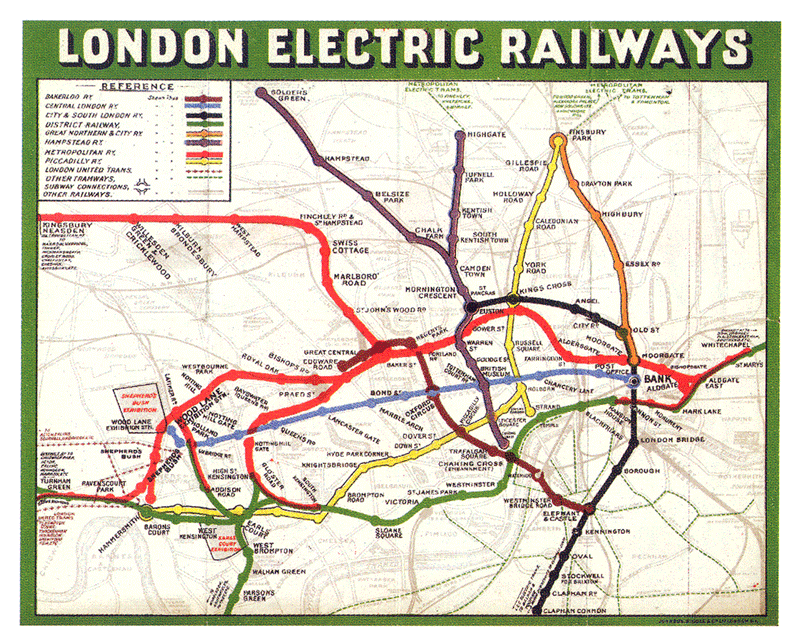
Original London Underground Map
If you are reading a medical record, do you read through the massive tables of vital signs, input and output? Or do your eyes skip around until they find an actual sentence?
Although those of us with IT backgrounds may go on and on about how important data is, we need to accept that the main purpose of medical records is to aid subsequent patient care. It’s not to protect you from lawyers. It’s not to support coding and billing. It’s to provide useful information to future caregivers. And is the useful medical information in columns and rows of numbers? No, it’s in a few sentences of well-written English. Ask anyone who does chart review, and they’ll tell you that there are two parts they read first: the History of Present Illness section and any medical decision-making at the end. Other parts of the record (vital signs, allergies, meds, social history, input and output, physical exam) get read selectively if at all.
Here at ed-informatics.org, we have discussed abstraction and simplicity as elements of good information design. A classic example from the visual arts is a subway map. The original London Underground map tried to represent the actual geography of the subway lines. As subway lines proliferated, the map got to the point where it was simply too complex to be useful.
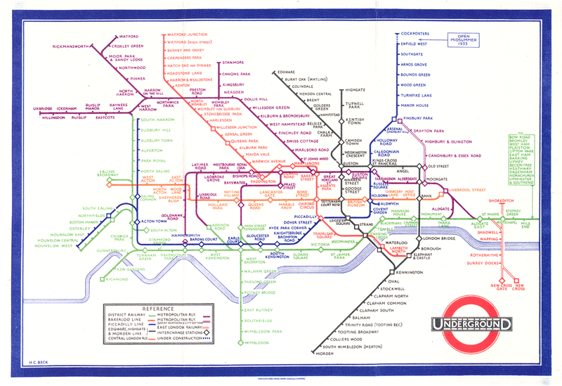
London Underground map after abstraction and simplification
But the 1931 revision by Harry Beck used the principles of abstraction and simplicity to confine the colored rail lines to 45 degree angles, and to compress the outlying stations into a simple and uniformly-spaced sequences. Similarly, the IT and clinical staff at UPMC are trying to do for progress notes what Harry Beck did for the London Underground map.
As we discussed in a previous post here, ignoring is hard cognitive work. The less extraneous garbage on the screen, the happier, and less error-prone, the user.
And for any pure IT folks reading this, especially coders, it applies to you as well as to medical providers. Read up on the concepts of information hiding and encapsulation. Apply them to your coding, but also to your user-interface design.

Tags: Human Error, Computers, Information Design, Charting, Information Technology, Healthcare, IT, Healthcare IT, Tutorial, Usability, User Interaction Design, User Interface
