- Brittleness
- Robustness
- Diversity
- “Niche” Computer Systems
- Downtime
- Meaningful Use
- Efficiency
- Anticryptography
- Color
- RHIO
- “Wrong Patient”
- Cognitive Friction
- Dialog-Box Rooms
- Ignore
- What’s in a word?
- ALLCAPS
- Layers
- Consistency
- Menu
- Cost Disease
- RAND
- PHR
- Model T
- Giveaway
- Skeuomorphism
- Icon
- Signal-to-Noise Ratio
- Anti-Data Pixels
- iPhones
- Suicide
- Anthropology
- Wireframes
- Fitts’s Law
- Kludge
- Ebola
- Pop-Up
- Clicks
- Bad Apple
- Testing
- Bold
- Point-and-Click
- Anti-User Pixels
- Flat
- Glucose

Claude Boutet's 7-color and 12-color color circles, 1708

Prism and Spectrum
When designing a computer screen, we have to keep in mind one of the defining elements of the computer monitor: its ability to display many colors.
Having desktop publishing software does not mean we know how to design a magazine, and just because we have color monitors does not automatically mean that we know how to use color. Indeed, just as with the rules for good typography, expressed most lucidly in Bob Bringhurst’s The Elements of Typographic Style, there are rules for color.

Bad Design

Color Theory
Color is simple.
We all learn in elementary school about primary colors and subtractive and additive combining of colors.

Primary Colors and Secondary Colors
There are a few other terms that you also need to know to be able to talk intelligently about color.
First is hue. Hue is the color, in the sense of where the color is along the spectrum from red, orange, yellow, green, blue, to violet. (Or, around the color circle, back to red; see below.)

Hues and Tints and Shades
Second is saturation. Highly saturated colors – those that are full of color – are vibrant and exciting. Highly saturated colors are great to indicate an emergency; but in the ED, where most “emergencies” are considered routine, highly-saturated colors should be reserved for life-threatening emergencies, such as a lab result that is truly life-threatening, say a potassium of 9.
There are two ways to dilute a hue to make it less saturated. You may add white to it – this is a tint. You may also desaturate a color into a shade by adding black.
Color is also very, very, VERY (did I say very?) complex.
Think of Newton’s experiments with prisms. It seems simple and easy to understand: color is the frequency of light. But then why can we take Newton’s spectrum and tie it end-to-end and make a circle out of it? That is, why does blue shade into purple shade into red when they are opposite ends of the spectrum?
It’s because (imagine a lot of hand-waving here) humans have three types of cones in our retinas that respond to three different wavelengths of light, and very sophisticated parallel-processing supercomputers in our retinas, not to mention complex processing in the brain’s occipital cortex.
I know, I know, that’s not a very good explanation. I told you it was complicated.
Some theoretical aspects of color are relatively simple and easy to understand, such as stereopsis, the disorienting effect of red text on a blue background – explained, at least in part, by the fact that we have to focus slightly differently to see blue and red due to the difference in wavelengths. (Red and blue are close to one another on a color wheel but far apart on the spectrum.) But, in basic-science terms, much about our perception of color is still poorly-understood.

Stereopsis
To learn more about color theory, and to get a flavor of just how complex color theory can be, start with Wikipedia on color gamut, then check out Digital Expert’s page on Color Space Fundamentals. Using these two websites as a start, you may get as deep into color as you wish. Just don’t expect to get to a place where you feel that you truly understand color, it gets more complex the deeper into it you get.

Color Gamut
Enough with color theory; now, on to the mechanics of color.
Color Practice
There are some simple, easy, mechanical rules to help choose color combinations for web page design that provide adequate contrast, are visible to those with color-blindness, and are “web-safe” i.e., not dithered on color monitors, which applies not just to websites, but to anything displayed on a color monitor. Modern color monitors support many gradations of color, but it’s still safest to stick with “web-safe” colors.
These rules are easily found in a number of websites, programs and publications:
- GrayBit is a website grayscale-converter to remove color and allow one to more easily appreciate contrast or its lack;
- checkmycolours, which is an online tool for analyzing website contrast;
- Colblindor‘s website, devoted to information about color blindness;
- Coblis, which is an online color-blindness simulator; and
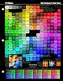
- the famous Visibone Webmaster’s Color Charts – which have honored places on the walls of my office.

Complementary Colors
Assume you have picked a single color that you like for your page’s background or overall color. How do you choose a pleasing combination of other colors which will “go” with it? At least to a first approximation, this is actually easy and fairly easily automated.

Triadic Colors
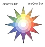
A quick shortcut for choosing color combinations – for instance, the standard monochrome, complementary, triadic, tetradic, or analogic color schemes – has always been a color wheel, which has been around in one form or another for centuries. The best example of this I have seen is Itten’s Color Star, which is made out of two circles of cardboard attached at the middle. It is out of print but still available for purchase on amazon.com as I write this – for only $500. (It cost me $25 when I got one a decade ago.) But thanks to the web, you don’t need to spend $500 for two pieces of cardboard, you may simply click on the following links to get the same functionality online or via shareware downloadable software:

Tetradic Color
- Color Scheme Designer, which is an interactive color wheel for picking color combinations;
- Tigercolor, whose website offers excellent color tutorials as well as the excellent Windows programs ColorImpact and UltraColorPicker; and
- ColoRotate and ColorJack, which offer highly-interactive color scheme designers.

Analogic Colors

That phrase I used above, “to a first approximation,” reminds me of the physicist’s recipe for fried chicken: “First, assume a spherical chicken… ” Not all color combinations picked using a color wheel are as pleasing as others, or appropriate to a particular use. Choice of a color combination gets you a color palette that’s basically workable. But getting one that’s actually good requires some more knowledge of the interaction of color, and maybe some fine-tuning.
Color Choice
Picking which colors and color combinations to use, and using them appropriately to make a functional and pleasing user interface, is more of an art than a science.
Indeed, it is art, and if we want to learn how to use color effectively on computer screens, we have to look to artists – who, after all, have spent millennia perfecting the use of color.
If one says “Red” (the name of a color) and there are 50 people listening, it can be expected that there will be 50 reds in their minds.
And one can be sure that all these reds will be very different…
–Interaction of Color , Albers, J., Yale University Press, 1963.
Those with an engineering or computer science background are probably reading this and either (1) rolling on the floor laughing (rotfl) at the idea that they might want to study art, or (2) screaming “No! No! No! You can’t make me learn about art!”
Relax. It’s not as bad as you think.
If you really want to preserve your tech-y reputation, first read the English translation of Goethe’s Theory of Colours. After having done this, if any of your colleagues have the temerity to accuse you of being artistic, you will have an armamentarium of abstruse technical information about color which which to confuse and stupefy them (not to mention being able to quote Goethe, which is the literary equivalent of cutting someone off at the knees). Seriously, Goethe was as good a scientist as he was a writer and a playwright (he wrote the massively famous Faust), and his book on color is still probably the best investigation of color ever written, Newton’s Opticks notwithstanding.


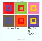
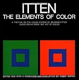
As with art, technical people think of philosophy as a morass of muddy thinking and deliberate obfuscation. But there are philosophers of science such as David Harriman, whose The Logical Leap: Induction in Physics is a model of simplicity and clear thinking; I’m sure my 12-year old daughter could get through it with only a little bit of help, and likely enjoy it. Similarly, there are a few art professors who are more interested in clarity than obfuscation. The two most well-known proponents of simplicity and clarity in the art of color are Johannes Itten and Josef Albers. Their published works are straightforward and filled with examples.

Take a look at the cover of Alber’s Interaction of Color (1977 paperback edition; right). The two brown squares – whose browns appear quite different – are actually the two ends of a strip of brown construction paper under strips of navy blue and yellow construction paper. Rather than simply seeing this (and his other examples) as clever optical illusions, Itten makes us analyze why we perceive them differently, and then use this knowledge to choose color combinations appropriate to our needs, and to be cognizant of the effects of the colors we choose.

Josef Albers' Interaction of Color
Studying Albers (preferably the recent Interaction of Color: New Complete Edition; compared to the Itten Color Star it’s a steal at only $126) is the ideal way to learn practical rules for using color.
Similarly, Itten’s The Art of Color: The Subjective Experience and Objective Rationale of Color is the other classic on color, giving rules of thumb for the effects that colors have on people.

Pantone used to have a computer program called ColorUP that guided artistic ignorati like me in picking color combinations appropriate for various audiences – Do you want a serene palette to relax your audience? A bright palette to get them excited about your new idea? A palette that comes across as warm and friendly? Maybe a very professional-appearing palette? – and then, once you’ve picked the right palette, you could export it to PowerPoint. Seemed like a great idea but they discontinued it. (It came on a 3.5″ floppy disk if that gives a clue to how long ago.)

Pantone ColorUp Palette Chooser
Now that the Pantone Colorup program is no longer available, I have found no single brainless method for picking palettes. If you don’t want to read the Albers and Itten books, you can pursue several inexpensive online alternatives (though inferior – the Itten and Albers books are superb). Check out:
- uxmatters.com‘s two-part tutorial on color for digital displays;
- Chapter 5 from Lesson One from the online color photography tutorial from St. Louis Community College;
- worqx.com‘s tutorial on Itten’s color contrasts;
- WriteDesign’s tutorial on Color Rules of Thumb;
- shutterchronicle.com‘s page on Johannes Itten On Contrast;
- user.com‘s page on applying Albers’ rules to user interaction design;
- an online interactive version of one of Alber’s plates;
- another interactive version of several of Alber’s plates;
- the University of Minnesota’s online reproduction of 56 of Joseph Albers’ color plates (alas, without the accompanying text);
- and, most importantly, Adobe’s free site Kuler, which also has a library of palettes that people have created and posted for you to download, complete with reviews. Browsing through the palettes on Kuler is likely to get you to a color combination suitable for your needs the quickest, now that the Pantone Colorup program is no longer available.
Having now reviewed the basic science and art of color, you may ask, are there any rules specific to medical software?
Color Usability
While not as well-established as Itten’s or Alber’s rules, we can probably come up with a few, based on a some basic principles.
Designing software for medical use is a real test of the designer’s talents, as lives hang in the balance. It is also true that medical users tend to be quite critical of poor design, and quite a few systems have failed because medical users have refused to use them. (Although medical users, particularly in the ED, tend to phrase this differently: “We don’t tolerate any BS here.”)
I have always maintained that if you can design a program that works well in an Emergency Department, you can design something that will work well anywhere.
We know that medical personnel – whether physicians, surgeons, nurses, technicians, or secretaries – are often very busy. They are often distracted by interruptions, particularly in the Emergency Department.
There is a recent (2011) change in the US medical education rules so that interns can only work a maximum of 16 hours at a stretch, but that doesn’t apply to upper-level residents or attendings. And US nurses, during nursing shortages, are routinely “mandated” to stay on for an extra 8 hours after the end of their 8-hour shift. So medical personnel are routinely sleep-deprived. And, especially in EDs, there is a shortage of qualified doctors and nurses, and they tend to be chronically overworked.
So, at least in the USA, medical personnel, despite their innate intelligence and high level of training, are being set up to make errors.
Several years ago, I discovered what I firmly maintain is the best test ever devised for usability of software. Take a sleep-deprived intern, one who was on call last night and who has only had a few hours of sleep. Sit the intern in front of a computer in a busy ED. The test works best if nearby are a demented nursing home resident screaming “Help me! Help me! Help me! Help me!” and a patient with a kidney stone loudly vomiting and moaning in pain. Give the intern 30 seconds of orientation to the computer program. If the intern then can use the program effectively throughout the remainder of the shift, the program then passes this sleep-deprived intern test. I only know of one program that met this requirement – the old DOS version of Logicare Checkout, an ED discharge-instruction program. (The more modern Windows version of Logicare’s software, while quite usable, doesn’t quite rise to this level of usability.)
The sleep-deprived intern test is an extreme example. But a busy ED or inpatient ward with patients in the hallway due to a high census can be very busy and distracting, and medical errors can kill. So usability is even more important for medical than other software.
Those of us in the medical field need software with low cognitive friction; for example, it needs to recognize the limits of foveal vision, and the need to scan screens with our foveal vision, as discussed in Computers in the ED 8.
Studies of human error emphasize the Swiss-cheese analogy, first propounded by James Reason in his excellent book Human Error. When trying to prevent error, we have to realize that nothing, especially not a system we set up to prevent error, is foolproof. Since nothing is totally foolproof, safety systems are like slices of Swiss cheese: each safety system has holes in it. Since all we have to prevent error is Swiss cheese, we should use multiple slices of our Swiss cheese and make sure that the holes don’t line up.

Error: Reason's Swiss Cheese Analogy
It is impossible to make anything foolproof as fools are so ingenious.
–anon
Which means that we need to use every tool in our design armamentarium, including color, to prevent error. When we know that someone has to use foveal vision to scan across a page, we can use preattentive attributes (including… color!) to guide the eye to the “right” place. The right place is generally the most commonly-used option on the page. If user’s eyes and fingers are routinely drawn to something that is used infrequently, then errors will be more common.

Let’s look at a wildly-successful example: amazon.com. To the right is what I saw when I entered the site as I was writing this. Let’s analyze the colors. First, what is the dominant color? The white background. And the other colors are a complementary pair: predominantly blue, in various tints, with highlights of orange. Since orange is so eye-catching, blue rightly predominates.

Amazon Home Page 4-27-11
The site uses several methods to indicate clickableness. (Affordance is a less-awkward if lesser-known term for the same thing.)
Just to the right of the Amazon.com logo is the wording “Hello, Keith Conover. We have recommendations for you. (Not Keith?)” – note that, in accordance with accepted standards for in-text links (and as Donald Norman says, we violate such standards at our peril), the links in the text are both blue and underlined.
There are a many other links on the page, in a variety of style; but color-coding helps us, insensibly, make sense of them. Just below the “Hello, Keith… ” text are a series of words in blue: “Keith’s Amazon.com | Today’s Deals | Gifts & Wish Lists | Gift Cards Your Digital Items | Your Account | Help.” These are not underlined, but they are in a standard place for clickable links. And, when you run your mouse over them (“rollover state”), a blue underline appears, making it clear these are clickable links.
Along the left, there is a large and very clickable orange “Shop All Departments” with links for the most common departments below.
Note that the eye-catching orange is used sparingly: in a light tint to highlight the ad at the center of the page (which as a whole is clickable); and in an orange caret (>) to highlight the black-on-blue-tint department listings on the left, and to indicate they are clickable. And if we start realizing, even at an unconscious level, that orange is a clickable color, our eyes are led to the orange GO next to the search box.
So what are the main orange-ish elements on the page?
- “Shop All Departments” and the main departments below
- “The Kindle Family” on-sale feature of the day
- “Go” to search for something
It is no accident that these are the most important things on the page, from Amazon’s view. Amazon wants you to be able to easily figure out where to click. The most commonly used clickable links and buttons are thus highlighted with orange.
Thus: color, used according to the rules, will help guide the eye, preattentively and without the need for foveal scanning, to find the right place on the screen.
The implication for medical software is that to decrease error – often error means clicking the wrong place with the mouse, or touching the wrong place with a stylus or finger – we should highlight the most commonly-used links/buttons with judicious splashes of color.
Let’s look at another example from amazon.com. Assume we want to spend $500 to get a genuine Itten Color Star. (BTW, if you want to do this, please contact me before going to amazon.com… )
When a few days later, I started ordering the Itten Color Star for the purposes of this demonstration (and the price had dropped to $35; I wonder if anyone bought one the week prior for $500), to the right is what I saw.

Amazon Itten Order
Note that everything above the orange-tinted block with “Instant Order Update for Keith Conover… ” is the essentially the same as on the home page.
And where is your eye drawn? To the two bright orange buttons, which not only appear in orange, but have a pushable button appearance, as well as being outlined in complementary blue. Yes, there are other clickable elements – a few blue underlined text links, a row of orange stars that are clickable, and a couple of buttons that are deemphasized by being in the slightest tint of orange, not being outlined in blue, and not shaded to appear as prominently protuberant as those two major buttons.
So, by the clever application of color, amazon.com has made clear which button you should click, which are less-important options, and which are tertiary options. And, given what you are most likely to do when on this page – order the book – design and particularly color guide you to doing the right thing.
Would that medical software was designed with as much care. When one is using medical software to perform high-frequency tasks – in the ED, for example, discharging a patient – design and particularly color should also be used to guide you to doing the right thing. This means that screens, which may be cluttered by choices that are secondary or tertiary (or in most medical software, quaternary: things you basically never do), should have the high-frequency items colored as prominently as the two main buttons on this amazon.com page. If this means different screens for doctors and nurses doing high-frequency tasks like discharging a patient from the ED, then the vendor should implement such screens. It should be as easy – the cognitive friction should be as low – as ordering a copy of Itten at amazon.com.
In the first edition of his magnum opus About Face: The Essentials of User Interface Design, Alan Cooper coined the phrase “No matter how cool your interface, less of it would be better.” There is no dearth of intrusive, in-your-face interfaces upon which to gaze with disgust, and there are a smattering of elegant interfaces upon which to gaze with some approbation. But since this essay is on color as a feature of the user interface, we should focus critically on just the use of color in the interface.
First, let’s look at UltraEdit. This is a text editor, used for programming and other similar tasks. For many years, it has been the most highly-rated text editor. I have it and my hacker/coder side is extremely pleased with it, as it does everything I want, and does it elegantly. However, it is by, for and of hackers/coders, and I sometimes find myself browsing or posting messages on the support forums because I just can’t figure out how to do something relatively simple with it (for example, changing the typeface on the screen). So the user interaction design, while not bad, is not highly-refined.

UltraEdit User Interface
I would like you to look at the screenshot of UltraEdit, and note the buttons with icons (“buttcons” per Alan Cooper, not that the term has caught on). Many of them have at least some color. While not as bright as the icons on many other programs, they use considerable color.
Next. let’s look at Adobe‘s page-layout/desktop publication program InDesign.

InDesign CS5 Interface
Adobe is famed for the difficulty of its programs, and Alan Cooper says he’s been itching to get his hands on the Adobe Photoshop interface for years. But part of the usability issue with Adobe programs is just that they have so very many functions that organizing them all is quite hard.
Adobe has been gradually improving their interfaces significantly over the years. One of the ways they’ve been improving them is to gradually remove color from the interface. When you look at the “buttcons” on the InDesign screen, you see very little color. Indeed, one change from the previous InDesign CS4 to the current InDesign CS5 was to take the color away from the InDesign logo in the left upper corner.
Why this sparing use of color? What is so bad about color?
Well, color is good in the right place. But for a program like InDesign, which is used for designing color catalog and magazine pages, the place for color is in the page being edited. Color in the surrounding tools tends to drag your eye away from the document in the center of the screen. Given the higher resolution of screens these days, Adobe has designed icons that are easily identifiable despite being mostly “colorless.” There is an underlying impression out there that color icons are easier to recognize than grayscale icons, but Adobe has demonstrated that it ain’t necessarily so.
If you are designing an application to be used, say, in a disco, then lots of bright colors and flashing, spinning icons would be appropriate. But for medical applications, where people are usually very busy, or very tired, or very distracted, or more likely all three, then a calming color scheme is more appropriate. The old Pantone Colorup program recommended as a “serene” combination something based on blue as a background, with contrasting analogic highlights but in desaturated tints and shades.
Can use “trident” color scheme to have basic color (blue, calming) and different colors for docs, nurses, secretaries (main users).
The Bottom Line
Color, as applied to user interaction design (the current in term for user interface design) is both simple and very complex. Review the above websites to get at least a flavor of the complexity.
If you are trying to consider color when designing of a computer screen (or, you may use this to analyze an existing computer screen), here is a simple algorithm to follow:
First, pick a color scheme. The easiest way is to browse successful websites, and steal one of their color schemes. You can’t go wrong by, for example, using amazon.com’s scheme: blue with contrasting orangeish highlights. If you want to be a bit more adventurous, or want to get the precisely right color scheme, go to the Adobe Kuler site and browse the color schemes until you find one that suits your taste. If you are wedded to an official corporate color, go to Color Scheme Designer, set the base color to your corporate color, then pick a type of color scheme (such as complement or triad). Adjust colors slightly, if needed, to make them “web-safe” using the online or printed Visibone tools.
Second, test your color scheme. Mock up a web page using your color scheme.
Use GrayBit to make sure that you have adequate contrast.
Use Coblis to make sure the scheme is visible to those with color blindness.
Third, critically analyze your use of color.
Are you using the accent color sparingly to make it easy to do the right thing and hard to do the wrong thing?
Are you making any glaring errors such as putting red text on a blue background to cause steropsis?
Are you using too much saturated color? Do you need to use more tints or shades?
Finally, compare your work to well-designed interfaces, such as current Adobe products, or successful websites such as amazon.com or google.com.
When you realize that each color is changed by a changed environment, you eventually find that you have learned about life as well as color.
–Josef Albers
I hope you’ve enjoyed this tour of color and usability. There are many good websites about color out there, many of which are linked above. But I hope that this very usability-oriented color essay is also useful.

Tags: metaphor, ED Systems, Emergency Department, Computers, ED, Information Technology, Healthcare, IT, Healthcare IT, Color
