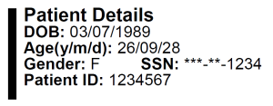
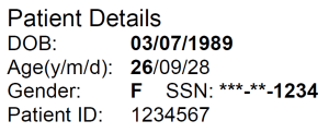
Sometimes usability is just typography. Or perhaps common sense. Look at the following demographic section at the top of a LabCorp lab report. (Yes, I like to name names. It’s OK: truth is an absolute defense against claims of slander.)
Imagine you’re working in a very busy ED and the follow-up nurse hands you a lab report with this at the top. Quick: How old is this patient? Male or female?
My reaction: AAAARGH! Yes, the reason I picked this example is because it really bothers me. And, because it provides a really good bad example which is excellent for teaching purposes.
This is a great example of terrible information design. Yes, whoever laid out the top of the LabCorp lab report probably knows nothing about information design, usability, or typography. But this is no excuse: hire someone who know something about this things!
This design is an invitation to medical error. If you order an antibiotic for this patient, if you write for a dose for a 9 year old, it won’t be enough for a 26 year old.
Don’t take my word for it. Let’s go through some simple restructuring, one bit at a time. Once we’re done, compare the end result with LabCorp’s original, and come to your own conclusions.
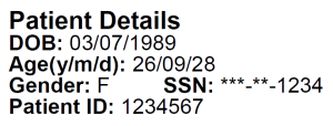
First, let’s lose that big vertical bar on the left. It does nothing for the readability or usability of this information. If it had little vines and flowers on it, you could argue that some decoration would spice up this otherwise boring lab report, but a big black bar isn’t even pretty.
That looks a bit better.
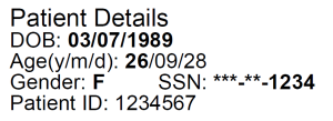
Now, let’s address the title of this post: BOLD. What should be bold? This is not rocket science, brain surgery, or even information: the information you’re looking for should be bold. Duh. So let’s switch this around, and make the most important information bold, and all the rest not-bold:
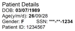
That looks a bit better. Let’s keep on with the cleanup. Doesn’t that look a bit, well, crowded to you? There’s not much spacing between the lines. We’ve discussed typography before, in the posts on ALLCAPs, Glucose, Color, Information Design 2, and Data Display, if you want to learn a bit more about typography in general. In this particular case, we need to talk about leading, pronounced not like “leeding” a horse to water, but applying the metal lead: “ledding.” This is a typographic term back from when printers inserted little strips of lead between lines of type. We rate the size of type in points, because that’s what printers have been doing for centuries. We also therefore use point sizes to measure the spacing between lines of type. What we see here is 12 point Arial, set to leading of 12 points: no extra lead strips at all. This is known as close spacing or solid leading, and is used where space is at a premium, and you’re willing to sacrifice legibility and readability. But don’t you think that in a medical report, legibility and readability are important? Normal leading for 12-point type would be 13.4 points (at least that’s what most word processing and page-layout software think).
Let’s say you’re the designer of this report: you argue for more leading, but your supervisor says “we don’t need more spacing for this information, because we want more space for the actual report!” After arguing a bit for 13.4 point leading, you finally compromise on a single extra point of spacing, (12 point type on 13 point leading), just one point between each line, for a total of five points, which means that this block will now be just a tad larger in height, but just by 0.0694444 of an inch. Here’s the more-readable result:
Next, let’s try lining the data up a bit, which makes it easier to pick out the data:
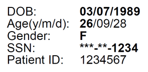
Next, let’s kill that “Patient Details” heading at the top. If you can’t figure out from looking that this is patient details, having a heading that tells you that isn’t going to help:
Since this gives us an extra line, let’s use it to get rid of line three, which has both gender and social security number on the same line. We’ll give SSN its own line:
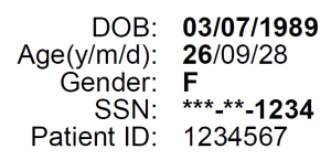
This is looking a lot better. One final improvement: let’s make the left-hand column right-justified:
Compare this with the beginning. This is basic typography and information design, and once you’ve seen it, it seems obvious. But if you’ve never seen it before, it’s not at all obvious, which is the reason for this step-by-step tutorial. If you find this interesting, you should read Tufte’s books:
[asa]0961392142[/asa]
[asa]0961392118[/asa]
[asa]0961392177[/asa]
[asa]0961392126[/asa]
Tags: Human Error, Typography, Usability, User Interaction Design, User Interface
