- Brittleness
- Robustness
- Diversity
- “Niche” Computer Systems
- Downtime
- Meaningful Use
- Efficiency
- Anticryptography
- Color
- RHIO
- “Wrong Patient”
- Cognitive Friction
- Dialog-Box Rooms
- Ignore
- What’s in a word?
- ALLCAPS
- Layers
- Consistency
- Menu
- Cost Disease
- RAND
- PHR
- Model T
- Giveaway
- Skeuomorphism
- Icon
- Signal-to-Noise Ratio
- Anti-Data Pixels
- iPhones
- Suicide
- Anthropology
- Wireframes
- Fitts’s Law
- Kludge
- Ebola
- Pop-Up
- Clicks
- Bad Apple
- Testing
- Bold
- Point-and-Click
- Anti-User Pixels
- Flat
- Glucose
 Skeuomorphism has been around for a long time.
Architects including Frank Lloyd Wright have eschewed it. Alan Cooper, known as one of the founding fathers of user interaction design for computer systems, decried it in the first edition of his classic text, About Face: Essentials of User Interaction Design. And more recently (~October 2012), people have compared Apple products with the new anti-skeuomorphic Modern UI (in-speak for User Interface) of Windows 8, previously known as Metro, and accused Apple of poor design because of rampant excess skeuomorphism.
Skeuomorphism in architecture (or car decoration) might be wood-grained vinyl. Skeuomorphism in software design might be a graphic of a spiral binding along the edge of a note-taking program’s screen.
Is it good? Is it bad?
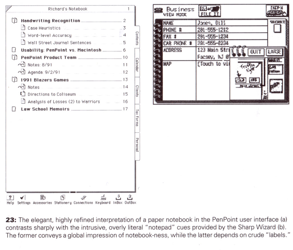
Figure from Mullet+Sano: Designing Visual Interfaces
There are arguments in favor of skeuomorphism… it makes it easier for new users to figure out what software does. A good example is the shutter sound on cellphone cameras. There is a need for a sound that tells you that a picture has been taken. And using a sound that associates with old shutter cameras works. Even if you’ve never used a camera with an actual shutter, you may be familiar with the sound, as it’s a defacto standard for all sorts of digital still cameras. Donald Norman and Jakob Nielsen point out that if we flout standards – such as underlined blue text for links, or skeuomorphic Trompe-l’œil buttons to push with our mouse – we do so at peril of making something unusable, something poorly learnable and poorly memorable.
But, in a January 2013 article in Forbes magazine “Will Apple Dump Skeuomorphics In iOS?” Tim Worstall writes: this is only important in the transition from one way of doing things to a new one. You’ve only got to appeal to memories and habits of older technologies when people still have those memories and habits. Once you’ve a new generation of people, people who have grown up only ever having used the new technology, you simply don’t need those reminders of the old.
I’m not sure skeuomorphism is the best way to transition to a new paradigm. If the new paradigm has an excellent user interaction design, there is little or no need for skeuomorphism. It’s a crutch, and not a great one at that.
David Pogue writes, in the Scientific American article “Apple Shouldn’t Make Software Look Like Real Objects“: How many members of Generation Y have ever even used a Rolodex?
He points out how Windows 8 has gone the exact opposite direction: no skeuomorphs to be seen. Big, boxy tiles, which you can touch with a finger (well, unless you have a PC with a non-touch screen). No shading. No shadows. No raised buttons to provide affordance.
I have my own issues with Windows 8. Trashing the Start Button to force people to the “Modern-previously-known-as-Metro” start screen is a blatant ploy to make people learn the new Modern interface.
Not that learning the new interface is bad, but having to switch from the desktop to the Modern/Metro interface sucks compared with the Start button as a way to quickly access programs from the desktop. As soon as I got a new PC with Win8, I bought Start8 from Stardock and installed it. Once I made that change, I found Win8 a just outstanding desktop operating system. There are many improvements from Win7. One of my favorites: I can mount .iso CD or DVD images just by double-clicking on them. This means I can make a .iso of a program’s CD for programs it will only install when it knows it’s running from a CD… and just run it from the .iso file. Slick. There are many other improvements under the hood.
But I like the Modern/Metro interface. Skeuomorphism may improve learnability the first time you use a program or device, but it gets in the way after that. Massive simplicity as in the Win8 Modern/Metro interface may take a few seconds more to learn, but it’s still quite easily learnable. And it’s easier to use than the iPad once you learn it.
Metaphor Run Amuck
Skeuomorphism is related to metaphor.
Something on a computer or cellphone screen that looks like a bookshelf is a metaphor. In Cooper’s original 1995 first edition of About Face, he gives a great example of metaphor run amuck, a product which will here remain nameless to avoid embarrassing the original coders. It’s shown to the right. As he says: Never bend your interface to fit a metaphor.
 He points out that there is a difference between metaphor (and, by extension, skeuomorphism) and idiom. For example, the standard radiation symbol is an idiom. There is nothing skeuomorphic here: this is an abstract symbol. But it’s very rapidly learnable and memorable.
Cooper says: All idioms must be learned. Good idioms only need to be learned once.
Windows 8 Modern/Metro interface has good idioms. (It also has good direct manipulation (pressing and sliding tiles, for example. Again quoting Cooper’s About Face: A rich visual interaction is the key to successful direct manipulation. But direct manipulation is a story for another time.)
But my favorite About Face quote is apropos: No matter how cool your interface is, less of it would be better.
Medical software needs less skeuomorphism, such as Cerner FirsNet’s indecipherable icons (for example, the one that is supposed to look like a registration clerk and everyone refers to as “The Buddha”), and more good idioms.
Less is More
—Mies van der Rohe

Tags: Skeuomorphism, Computers, Alan Cooper, Information Technology, Tutorial, Usability, User Interaction Design, User Interface, Information Design
