- Brittleness
- Robustness
- Diversity
- “Niche” Computer Systems
- Downtime
- Meaningful Use
- Efficiency
- Anticryptography
- Color
- RHIO
- “Wrong Patient”
- Cognitive Friction
- Dialog-Box Rooms
- Ignore
- What’s in a word?
- ALLCAPS
- Layers
- Consistency
- Menu
- Cost Disease
- RAND
- PHR
- Model T
- Giveaway
- Skeuomorphism
- Icon
- Signal-to-Noise Ratio
- Anti-Data Pixels
- iPhones
- Suicide
- Anthropology
- Wireframes
- Fitts’s Law
- Kludge
- Ebola
- Pop-Up
- Clicks
- Bad Apple
- Testing
- Bold
- Point-and-Click
- Anti-User Pixels
- Flat
- Glucose
 There is an electronic medical record program (EMR) called DocuTAP that I use at one of my jobs. It’s not bad overall, and it’s the top-rated Urgent Care Center EMR. But, as with every EMR, it can be improved. In many ways.
I just ran across another new way in which it can be improved. This is a small issue, almost trivial. But as we discussed in Kludge, little issues, when they occur frequently, can have major impacts on usability, efficiency, and user satisfaction.
What’s the issue? In a particular circumstance, the computer doesn’t pay attention. It ignores me when. If this happened once or twice, I wouldn’t think too much about it. But since the computer keeps ignoring what I say on a regular basis, I start to think it’s deaf, incompetent, or maybe it’s just being mean.
We tend to anthropomorphize computers. Overall this is good. We expect program designers and coders to provide us with a computer program who is pleasant to work with, who is competent, who is tolerant of our mistakes, and who pays close attention when we talk to him. (Or perhaps her; but I think of this particular program as a him.)
In DocuTAP, once you’ve seen a patient, you have to select a diagnosis. DocuTAP is designed for iPads and the screen is iPad-size (small) even on a big PC screen. And there are a lot of possible diagnoses. So, to rapidly get to the right diagnosis, there is a row of alphabet buttons across the top. I click on the “S” button to get to “Sinusitis” and it quickly scrolls to the “S” part of the list. I can then easily click on “Sinusitis.”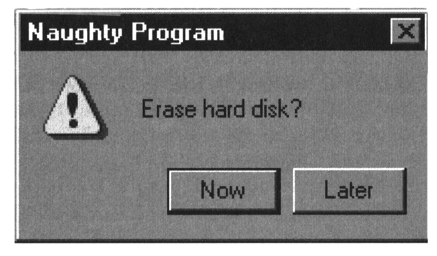
Except sometimes I can’t.
A while back, DocuTAP added a feature to remind us of things as we are discharging a patient. A classic example is when the patient’s blood pressure is unexpectedly elevated. We tend to discharge patients without remembering to also select the diagnosis of “Elevated BP reading w/o dx of HTM (796.2)” and to print off the standard discharge sheet for “Hypertension, To Be Confirmed.”
So, when I click on that “S” button, what sometimes happens? I get a popup (a dialog box, also known as “modal window“) that reminds me that the patient’s BP is elevated. Reminding me is a good. Even if popup dialog box might not be the best way to do this. (More on this later.) But when I clear the popup dialog box by clicking on OK, I find that I still have to click on that “S” button again.
He is not listening. He ignored that click on “S.” He discarded that bit of information. I am not happy: “You are not listening! Pay attention next time!” But of course this happens the same way, every time. “You’re either stupid, or deaf, or just trying to piss me off! Stop it!”
As Alan Cooper says in the first edition of About Face: The Essentials of User Interface Design
If it’s worth asking the user, it’s worth the program remembering.
Fixing this particular issue should require minimal editing of the underlying code.
But there are bigger issues here.
One is creeping featuritis; when users want the program to do something, it’s easier to simply add in a kludge to take care of it. And the easy, quick kludge is to insert a popup dialog box. And then the program becomes cluttered with multiple dialog boxes. Lots of kludgy popups equals “klunky.” As Cooper says
A dialog box is another room. Have a good reason to go there.
and
Don’t stop the proceedings with idiocy.
A popup (modal dialog box) brings everything to a screeching stop. You can’t continue with what you’re doing until you click one of the buttons on the popup.
I suppose I should be using the term “modal dialog box” instead of “popup.” But the word “popup” does such a good job of capturing what people think about them! Like popup ads when browsing the internet, people hate “decision support” popups, almost as badly as they hate voicemail hell.
There are many horror stories about “decision support” tools, usually starting with a popup, making error more likely. And there is no question that intrusive popups are hated, with a passion, by clinical users. It’s the anthropomorphic equivalent of carrying on a conversation with the computer when it suddenly slaps you in the face and says “YOU ARE AN IDIOT!”
Recognizing this, the US government, which offers money to hospitals and doctors who implement decision support, has recently (July 2014) put up a FAQ noting that decision support doesn’t have to be via popups to qualify for the incentive. (And detailed explication of acceptable alternatives.)
What would be better from a usability perspective?
There are ways to make popups, not less intrusive, but better tolerated, as described in scholarly articles. But perhaps it’s best to get rid of traditional popup “alerts” altogether. But rather than just presenting me with information, you could offer to actually help me.
If the BP is elevated, you could ask “The BP is 150/90. Would you like me to print off the standard “Hypertension, To Be Confirmed” instructions and recommend follow-up with a PCP in about 2 weeks?” to which I could simply say “yes” and be done with it. I would then be happier, faster at my job, and less likely to take a sledgehammer to my computer.
I should point out that I am quoting from the first edition of About Face, from 1995, including the illustrations. As of November 2104, it is in its fourth edition. But our medical software – not just or even mostly DocuTAP – still needs to apply usability principles established 20 years ago.
***
Update, 1/29/16.
DocuTAP has been modified to have more popups, for a variety of things, mostly to make sure providers have captured charges, but also for some “decision support” reminders. I would guess that during a 12-hour shift I have to click such popups about 50-70 times. Here is the text of one of the popups, which pops up whenever you access the chart of a patient with a chief complaint of “sore throat.”
The patient has the following alert(s): Did you order a Rapid Strep test for the patient during this visit? The system is not detecting a charge for a Rapid Strep test. HEDIS guidelines recommend testing for Streptococcal infection, using either a Rapid Strep test or strep culture, for these diagnoses unless an antibiotic is being use-d to treat a secondary diagnosis. All patients for whom the Rapid Strep test is negative and are not treated with antibiotic therapy with coverage against Streptococcal infections should be considered for a confirmatory Strep Culture performed to catch false negative results on Rapid testing, which can be 15% or more depending upon the quality of the swab specimen. Failure to treat Streptococcal throat infections timely can lead to significant complications, such as glomerulonephritis and heart valve dysfunction. If a Rapid Strep test was performed on this patient, please clock “YES” below, and ensure that the test is ordered and results noted. Contact IT if there is a Rapid Strep test documented in the patient’s chart and you continue to receive this message.
Press ‘ Yes’ to acknowledge checked messages
* Indicates action is needed before locking this chart.
Yes No
This popup addresses a significant issue: detecting and treating acute streptococcal pharyngitis. Before we get into the informatics issues, let’s briefly discuss the medical issues. Rheumatic heart disease used to be a big problem back in the middle of the 20th century, but at least in the US it has almost disappeared. Indeed, David Newman (one of my emergency medicine ex-residents) argues, fairly persuasively, in a post at Emergency Physicians Monthly that we do more harm by treating strep with penicillin than we do good, as we have to treat millions of people to prevent one case of rheumatic heart disease, and some of those millions will have (and perhaps die from) an anaphylactic reaction to penicillin. (In the US, about 500 people die each year from such reactions.) Robert Centor agrees that we shouldn’t concentrate so much on strep, but he argues that we should use clinical criteria (three or more of: history of fever, tender anterior neck lymph nodes, absence of cough, and white exudates on the tonsils) to determine who needs antibiotics. He points out that Fusobacterium necrophorum is worse than strep as it causes Lemierre syndrome, and we don’t currently have a test for it. He also recently showed F. necrophorum is actually more common than strep at least in a college student health population.
There are also recommendations that we should not order strep tests on patients with URI symptoms, a sore throat, and few if any Centor criteria… but this dialog box triggers solely off of a chief complaint of “sore throat,” even if it’s paired with “congestion” or “runny nose.”
OK, so now we’ve discussed the medical issues, let’s focus on the informatics issues.
First, a basic information design issue. How much text is reasonable in a popup you are required to read and then click on a button? I’m not sure what your answer is, but since this popup covers most of the page, I suspect it’s more than most consider acceptable. It’s customary to provide a link to additional clinical information rather than include it in the text of a dialog box.
Next, does the dialog box offer to do anything to help you? No, it just (in the words of Alan Cooper, talking about how he hates dialog boxes in the first edition of About Face) “stops the proceedings with idiocy.”
What would you like this to do? If you press “yes” perhaps it could order the rapid strep for you.
This dialog box process, however, has issues related to the underlying architecture of the electronic medical record, or perhaps just due to a sloppy implementation. Any time you access the chart – for example, if you’re a physician signing off a PA or CRNP chart – the popup appears again.
In fact, if a patient ever had a visit for a sore throat, this popup will appear on all subsequent visits, even if the patient is just there for a drug screen.
Implementation issues aside, perhaps there are better ways to get at this problem of a perceived failure to order strep tests. I would suggest a kinder, gentler approach, perhaps even an elegant one. It would be harder to implement, but then great art requires sacrifices.
If the chief complaint is “sore throat” AND it’s (NOT) associated with “runny nose” or “congestion,” then a different reminder could trigger. It takes you to the place where you could order a rapid strep and simply highlights it, with a link to the reason why it’s highlighted. No need to click anything unless you have a question.

Tags: ED Systems, Emergency Department, Decision Support, Computers, Popup, ED, Pop-Up, Alan Cooper, Healthcare, Healthcare IT, Usability, User Interaction Design, User Interface
